
UX/UI Case Study
VirgoCX
A homepage redesign for a Canadian crypto exchange, built around trust and accessible colour.
Role
Lead UI Designer
Timeline
1 week
Team
Solo project
Tools
Figma, Illustrator, WebAIM
Problem
VirgoCX is a Canadian cryptocurrency exchange serving both retail and institutional investors. In an industry where security and trust come first, the VirgoCX design team invited me to redesign their homepage, modernizing the first impression and fixing long-standing usability friction.
The homepage also had to work within the existing brand guidelines while explaining complex financial products to a wide range of users, from first-time buyers to experienced traders.
Solution
My redesign focused on three principles that put clarity ahead of clutter, so VirgoCX can compete in the Canadian fintech market.
Heuristic Alignment
I audited the existing homepage against competitors and industry standards to find where design changes were needed.
Information Architecture
I restructured the product hierarchy to highlight key offerings without overwhelming new users.
Accessibility and Trust
I made the visual language meet WCAG 2.1 so the platform feels inclusive, professional and secure.
Competitive Analysis
I analyzed leading Canadian and global crypto and fintech platforms, including Coinbase, Kraken, Gemini and Wealthsimple, to find common design patterns and emerging standards. The benchmarking showed where VirgoCX could stand out while still matching the mental models users already have for high-stakes financial products.
Common Themes
Trust at the Core
Leading platforms use calm, minimalist design to build trust: neutral palettes with strategic accents and persistent visual reassurance.
Frictionless Onboarding
Progressive onboarding splits complex information into single-step screens with live validation, which helps reduce cognitive load and drop-off.
Information Management
Competitors use progressive disclosure to manage complex data. Key details sit inside interactive cards so the main dashboard stays clean and focused on high-level decisions.
Personalized Predictions
The standard is moving toward predictive UX, where dashboards reorder based on user behaviour and context so each person sees what is most relevant.
Colour Accessibility
In a financial product, trust depends on legibility. I used WebAIM’s contrast checker to test the existing brand palette against WCAG, so the interface stays readable for everyone, including people with low vision.
The targets I used: at AA, 4.5:1 for normal text and 3:1 for large text and for UI components such as buttons and icons. At AAA, 7:1 for normal text and 4.5:1 for large text.
Audit Results
To show why the palette needed work, I tested the original brand colours against the light background (#F5F5F5):
Primary Brand Tone, #7965E6
4.0:1. Passes the 3:1 requirement for graphics and UI components, but fails the 4.5:1 needed for normal text.
Secondary Blue, #739DE5
2.5:1. Fails both the text and the graphics standards.
Action Orange, #E49A81
2.1:1. Fails, which makes buttons and alerts hard to see.
Accent Red, #E09F9F
2.0:1. The lowest score, which makes error messages hard to read for people with low vision.
Colour Resolution
The legacy palette did not separate colours enough for a secure financial platform. I adjusted the saturation and luminosity of the core brand tones, deepening the Primary and Action colours so every critical pairing now meets at least 4.5:1 (AA). The homepage stays cohesive and technically compliant, and navigation and data are easier to read for every investor.
Typeface Accessibility
I treated typography as a functional pillar, not just an aesthetic one. In fintech, clear communication builds trust and supports accurate reading of data. Four accessibility principles guided my choices:
Readability Comes First
I used sans-serif fonts for legibility across screens. Clean letterforms reduce visual noise and make scanning easier than decorative serif fonts.
Optimal Sizing and Spacing
I set body text at 16px with line lengths of 50–75 characters to reduce eye strain for a diverse user base.
Responsive Scaling
I specified relative units (em/rem) instead of fixed pixels so text scales across mobile, tablet and desktop.
Semantic Structuring
I specified a semantic structure, such as h1 for titles and p for paragraphs, so assistive technologies read the hierarchy correctly.
Typeface Choice
I chose Inter as the primary typeface for its legibility on screens. Its clean letterforms and generous internal spacing stay readable at many sizes, which matters on a platform that displays complex financial data. A multi-weight system builds the hierarchy, and the smallest size stays distinct from body copy for users with visual impairments.
Inter’s open-source flexibility and clear character shapes give VirgoCX a type system that supports WCAG compliance.
Primary Titles · Extra Bold · 48pt
Trade Crypto with Confidence
Headings · Medium · 40pt
Your Portfolio at a Glance
Sub-Headings · Bold · 20pt
Secure, Regulated, Canadian
Body Copy · Regular · 18pt
Buy and sell digital assets in minutes.
Sub-Body and Metadata · Regular · 14pt
Prices update every 30 seconds. Fees shown before you confirm.
Final Redesign
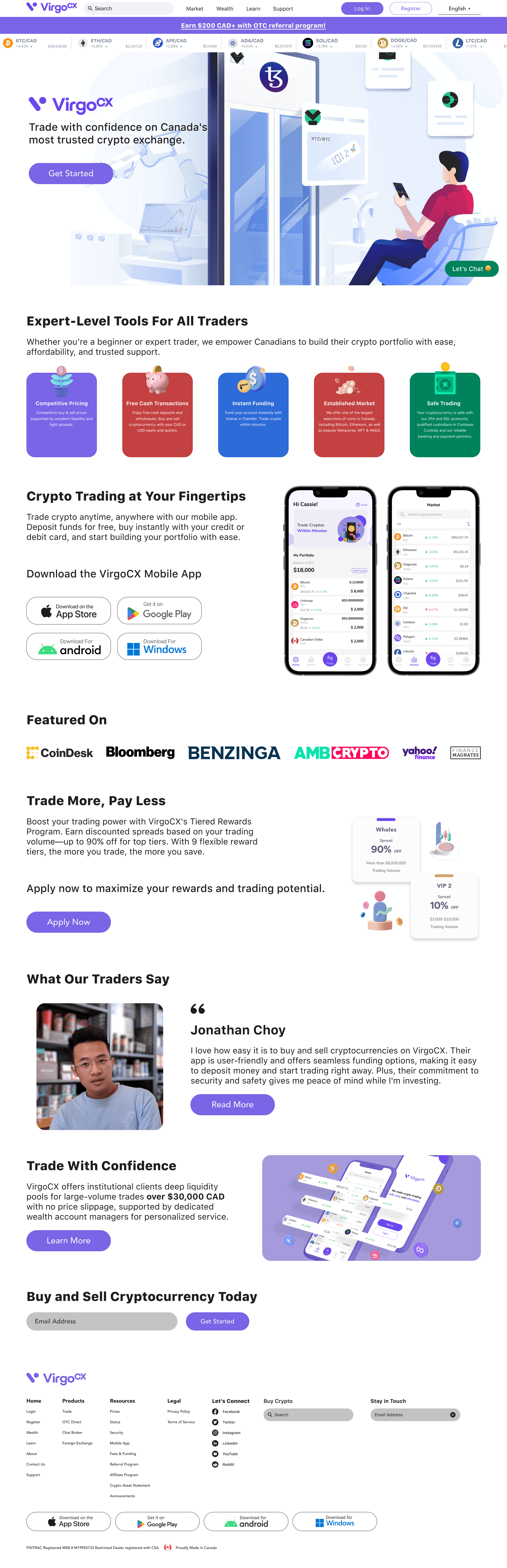
The final homepage turns a fragmented legacy interface into a clearer, more trustworthy gateway. I fixed low-contrast calls to action and surfaced buried trust signals, introduced a modular card layout to reduce cognitive load, and moved security certifications higher on the page. The design balances the data needs of institutional investors with the simple navigation that retail beginners need. I delivered the final designs to the VirgoCX design team.
Reflections
This engagement showed me how financial security and user-centred design intersect.
Accessibility Builds Trust
My audit showed that colour accessibility is more than a compliance task. Clear, high-contrast colour makes a financial product feel more professional and reliable.
Managing Complexity
In data-dense products, progressive disclosure balances what advanced traders need with the simplicity new users need.
Consistency Drives Efficiency
A standardized type and icon system reduces visual noise and keeps attention on financial decisions.