
UX Case Study
Unmasked
A mobile app that scans grocery barcodes and rates every ingredient on a 1–10 severity scale, so shoppers can decide with confidence.
Role
UX Designer & Researcher
Timeline
2 weeks
Team
Solo project
Tools
Figma Make, Google Stitch, Claude
Problem
Grocery shopping is high-stakes for people with allergies, fitness goals or ethical boundaries. Labels lean on vague marketing terms and chemical names, so shoppers get overwhelmed and either put products back or take a risk.
How might we give shoppers an instant, trustworthy verdict while they’re standing in the aisle?
Solution
Unmasked is a mobile app that scans a barcode, rates each ingredient on a 1–10 severity scale and explains each rating in plain language. A scale replaces the usual safe/unsafe alert, which creates needless anxiety and gives shoppers no context.
Levels 8–10 (Critical): High-contrast 🚫 red states and strong haptic feedback signal an immediate medical or ethical stop.
Levels 4–7 (Caution): Yellow ⚠️ states flag ingredients that are technically safe but may have long-term health implications or be ultra-processed additives.
Levels 1–3 (Safe): Green ✅ states confirm a product is safe to eat.
The scale makes Unmasked a daily companion for health-conscious shoppers and a safeguard for people with severe allergies.
How I Used AI
I used generative AI at three points in the design process.
Discovery: I used AI to simulate personas, from a parent managing a severe allergy to a competitive bodybuilder, and surface ingredients worth flagging that standard databases miss.
Ideation: AI wireframing tools let me iterate on one-handed layouts in hours instead of days.
Product: An AI layer translates chemical names and industrial ingredients into plain-English definitions drawn from verified databases.
Designing for Physical Context
The main use case is a busy aisle, so I prioritized one-handed ergonomics. Shoppers are often holding a basket, a child or a list, which makes top-heavy layouts hard to use.
I used a bottom-heavy layout, with the camera viewfinder, result drawer and navigation anchored within thumb reach. The detail drawer slides up from the bottom, so shoppers can switch between the 1–10 verdict and ingredient definitions without shifting their grip. It works in the aisle and at home.
Information Architecture
I built AI into the core of the product to solve information density. It maps obscure chemical derivatives and industrial synonyms to the severity scale in real time.
Each flag comes with a plain-language explanation of why the ingredient was flagged, with no clinical jargon. When a product gets a red verdict, the app also shows a safer alternative from the same category, turning a moment of frustration into a clear next step.
Research and Findings
Before designing, I combined secondary research and interviews to check that shoppers really need a real-time ingredient interpreter. I wanted to understand what happens between reading a label and deciding whether to buy.
Secondary Research
I reviewed existing research on the clean label movement and label fatigue to see how shoppers behave in retail environments.
Three findings shaped my design assumptions.
Clean Label Shift
64% of consumers report that short, recognizable ingredient lists are the primary source of trust in a brand. (IFIC)
Label Fatigue
Shoppers spend an average of 6–10 seconds looking at a product's nutritional information before making a decision. (PMC, NLM)
Jargon Barriers
70% of shoppers are wary of ingredients they cannot pronounce, even if they are medically safe. (Ingredient Communications)
Primary Research
I combined interviews with AI-simulated personas. Interviews gave me real emotional insight, and the simulations let me stress-test edge cases across dietary restrictions that interviews can’t cover.
I interviewed six people over Google Meet: parents of children with allergies, fitness enthusiasts and ethical shoppers.
User Interviews
Before each interview, I observed participants shopping to see how they handle products. All six struggled to hold a phone, a basket and a product at once, which led to a bottom-heavy layout.
In the interviews, vague terms like “Natural Flavours” and “Spices” caused the most anxiety. Participants often put products back because they couldn’t verify the sub-ingredients.
AI-Simulated Personas
To connect emotional pain points with technical ingredient data, I used AI to simulate personas and stress-test the severity scale against 150+ obscure ingredients across different dietary restrictions. These simulations were a way to find edge cases, not a replacement for real users.
To keep the results realistic, I didn’t just ask the AI to “act like a user.” I wrote high-context role-play prompts grounded in realistic constraints. Here are two examples, showing that Unmasked is a versatile lifestyle tool and not only a medical one:
“Act as Sarah, a 34-year-old mother of a child with a Grade 4 anaphylactic Tree Nut allergy. You are in a crowded, brightly lit grocery store with a fussy toddler. You are holding a package of granola bars. Based on an ingredient list I will provide, answer the following questions:”
Identify which ingredients trigger an immediate 'Stop' response pertaining to allergens.
Describe the emotional 'friction' you feel when you see an 'unknown' ingredient without a source specified.
Rank your confidence in purchasing this product on a scale of 1-10.
“Act as Marcus, a 28-year-old competitive bodybuilder 4 weeks out from a show. Your diet is extremely strict. You are currently at your local supplement store with a bunch of different supplements on hand. You are looking for an ‘all natural’ protein bar amidst the wide selection. Based on an ingredient list I will provide, answer the following questions:”
Identify which ingredients that, while 'Safe,' would be 'Red Flags' for your specific health and inflammation goals.
How does the presence of 'artificial sweeteners' and 'additives' affect your purchase decision?
What would make you 'Trust' this brand more?
AI Simulation Results
I ran the allergy-prone parent and the fitness enthusiast through the same ingredient data to compare how two very different mental models react.
The simulations did more than flag ingredients. They modelled the psychological friction of shopping, which helped me spot problems early in wireframing. They gave me hypotheses to test, not final answers.
Together, the interviews and simulations grounded Unmasked in both physical ergonomics and user psychology. I then gave AI my interview findings to generate the two personas below, as an experiment in turning research into personas.
Anxiety Loop
In the simulations, the longer a persona spent reading a label, the less it trusted the brand.
'Why' Demand
Personas wanted a rationale for each score to justify a purchase.
Contextual Urgency
Environmental factors made fine print in the ingredients lists a major accessibility barrier.
AI-Generated Persona: “The Vigilant Protector”

Sarah Jenkins
Stay-at-Home Parent & Senior's Home Volunteer
"Every grocery trip feels like there is a greater risk than reward. I’m staring at labels trying to figure out what certain ingredients mean and if it is safe to consume for my child. I just want to shop without the constant fear of the fine print."
Pain Points
Ambiguous ingredient terminology that doesn’t state their source.
Struggle to read microscopic text while managing a distracted child.
Skepticism towards deceptive marketing tactics used to hide ingredient risks.
Cognitive fatigue from spending excessive time reading ingredient lists.
Goals
Achieve a safety verdict on a product in real-time.
Reduce the mental load of memorizing chemical synonyms for allergens.
Discover new brands and products without hesitation.
Shop quickly while physically multitasking.
Behaviours
Sticks to list of curated brands to avoid the risk from scanning new products.
Reads entire ingredient list multiple times even for reputable products.
Uses secondary browser to search if ingredient is safe for allergens.
Acts as primary filter for all household consumption.
AI-Generated Persona: “The Performance Optimizer”

Marcus Bradley
Competitive Bodybuilder & Fitness Coach
“Brands love to slap ‘high protein’ on everything nowadays, but that doesn’t always mean it’s healthy. I’m tired of getting bloated from hidden fillers and inflammatory seed oils just because a label deceived me. I need the truth, not all the marketing fluff.”
Pain Points
Products marketed as healthier alternatives are often loaded with inflammatory additives.
Artificial sweeteners cause insulin spikes and ruin diet plan.
Thickener agents cause digestive distress and inflammation.
Lack of explanation for why specific additives are harmful.
Goals
Ensure every calorie consumed supports metabolic health and muscle recovery.
Avoid seed oils and artificial additives that hinder progress.
Build knowledge of ingredients and their effects on the body.
Find safe alternatives that don't compromise diet.
Behaviours
Uses nutrition trackers to accurately log every macro and micro-nutrient.
Goes straight to the nutrition facts and ingredients list.
Engages in fitness content and research to stay updated on food-industry trends.
Purchases whole, single-ingredient foods to avoid label fatigue.
User Task Flow
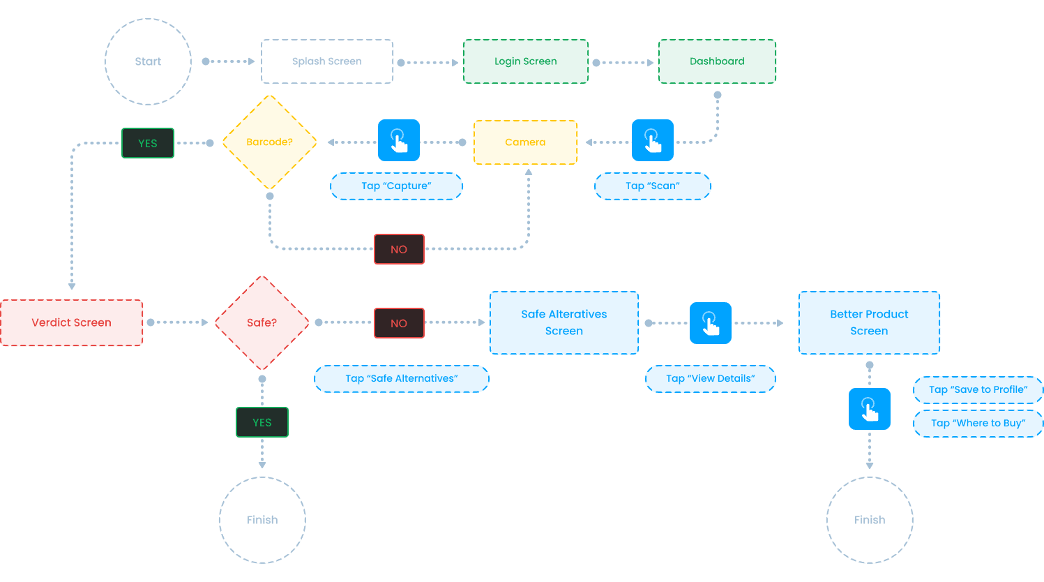
I designed a linear flow that prioritizes speed. A shopper should get a verdict quickly and turn a moment of friction into a win.
The flow has four stages, from discovery to resolution:
Personalized Entry: A splash screen syncs data in the background, then the user signs in and lands on a personalized home screen that summarizes their recent activity.
Scan Interaction: The user taps the primary “Scan” button in the thumb zone, which opens the camera. After a barcode scan, the AI checks the ingredients against the user’s dietary preferences and shows a high-contrast verdict with any flagged ingredients.
Alternative Pivot: Instead of a dead end, the user can view safer alternatives: a curated list of products in the same category that match their safety profile. Selecting one opens a nutritional comparison against the scanned product.
Final Resolution: With one tap, the user can save a safer alternative to a personal library of “frequent safes.” A local map and retailer list then shows which nearby stores have it in stock, with price and distance.
Design System
I took a minimalist, high-utility approach so information hierarchy comes first. Every element serves a purpose in a fast-paced, over-stimulating shopping environment.
Typography
Users are often scanning labels while moving, so I chose SF Pro Display (San Francisco) as the primary typeface. As the native iOS font, it feels familiar and stays legible across weights.
Heading 1 · Bold · 56px
Heading 1
Heading 2 · Bold · 48px
Heading 2
Heading 3 · Bold · 36px
Heading 3
Heading 4 · Semibold · 32px
Heading 4
Heading 5 · Semibold · 24px
Heading 5
Colour Palette
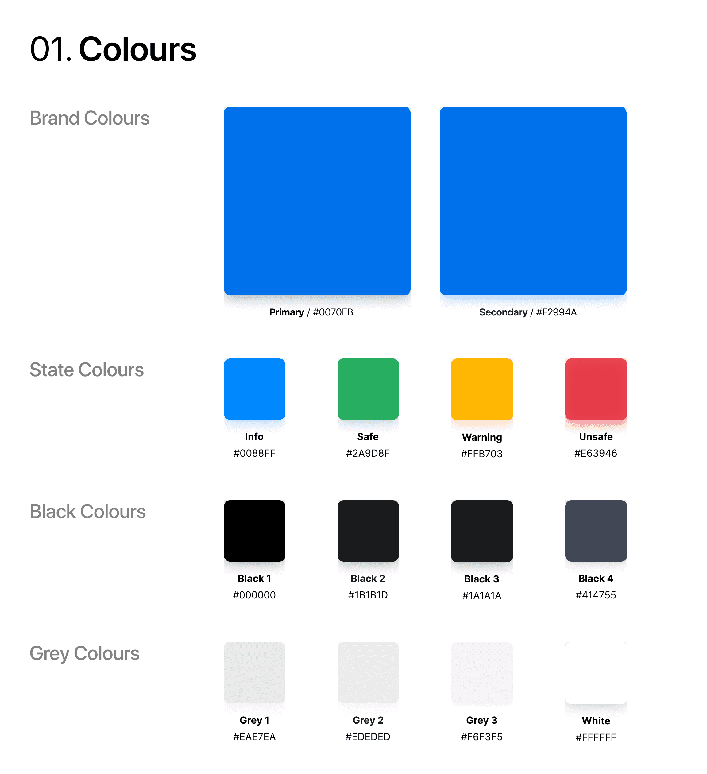
The palette has two parts: brand identity and functional feedback. The severity engine uses a traffic-light system, with the hues softened so they don’t feel alarmist.
Prototyping Workflow
Instead of static wireframes, I used Google Stitch and generative AI to move straight from structural logic to a high-fidelity, functional prototype. That let me iterate on behaviour and system logic in real time.
I defined the app’s foundation through three core requirements that guided the AI’s output:
Ergonomic Constraints
Every primary action the user performed had to be within the touchpoint boundaries established in the bottom of the screen (Primary Thumb Zone).
Information Hierarchy
The prioritization of information was first the results screen (Severity Verdict), followed by the "Why" (Flagged Ingredients List), and finally the "How" (Safe Alternatives).
Feedback Loop
The system was prompted to provide immediate tactile feedback through haptics and visual transitions that mirrored the urgency of the scan result.
Reflections
From Manual to Automation
When AI handles sketching and wireframing, my role shifts toward high-level orchestration. My value is less in how a component looks and more in why it exists and what it does for the user.
Prompting as a Design Skill
Good contextual prompting is requirements documentation in a new language. To get a high-fidelity prototype to work, I had to be precise about accessibility, ergonomics and hierarchy. When a prompt was vague, the product suffered, which showed me that domain knowledge matters more than ever.
Fail Fast, Fix Faster
AI prototyping let me skip weeks of low-fidelity sketching and spend more time on behavioural testing and semantic logic. That speed let me find and fix problems earlier than a traditional design cycle usually allows.
The Human Filter
AI can map an ingredient list, but it can’t understand the relief a shopper feels when the app confirms a safe choice. I had to supply that human side, and an empathy-driven approach is what makes the product feel like it understands the user, not just a tool.