
UX Case Study
Pullup
A mobile app that helps gym-goers find workout partners, so no one has to face the gym alone.
Role
UX/UI Designer & Researcher
Timeline
4 weeks
Team
Solo project
Tools
Figma, Illustrator, Photoshop
Problem
Many people feel anxious and out of place at the gym. Surrounded by headphones, crowded floors and people who seem to know exactly what they’re doing, newcomers often quit before a routine takes hold. This feeling is sometimes called “gymtimidation”.
Solution
Pullup helps people find a workout partner, so the first visit feels less intimidating. Users search by fitness goals, location and availability, send a request, then arrange to meet. The prototype focuses on this discovery flow.
Secondary Research
I reviewed industry reports and published studies on why people drop off at the gym. A common thread was that the obstacle is often social, not physical.
About Half Feel Intimidated
About 50% of Americans say they feel intimidated working out in front of others.
(OnePoll survey of 2,000 Americans, 2019)
Friends Improve Follow-Through
95% of people who started a weight-loss program with friends and social support finished it, compared with 76% who started alone.
(Wing & Jeffery, 1999)
Gen Z Is Showing Up in Gyms
82% of Gen Z regular exercisers work out in a gym, up from 64% in 2021.
(Les Mills, Gen Z Fitness Report)
Primary Research
I interviewed gym-goers, in person and remotely, from first-timers to seasoned lifters. I paid attention to both what they said and how they acted to uncover the anxieties they didn’t say out loud.
Across the interviews, the common theme was less about physical ability and more about feeling socially safe. Three themes came up most:
Gym Overstimulation
Not knowing what to do, or feeling you have to be in shape to walk in, leads people to over-analyze every movement and feel out of place.
Bad Gym Vibes
Excessive competitiveness and little respect for personal space push people to put comfort ahead of their fitness goals.
Body Image Blues
Comparing themselves to unrealistic fitness standards makes exercise feel like a performance instead of a personal health journey.
User Persona
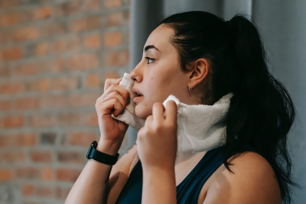
Andrea Weston, 36
Elementary School Teacher & Caregiver
“I want to be consistent, but the moment I walk through those doors, I feel like a guest in a space I don't belong in. It’s easier to stay on the treadmill where it’s safe than to ask for help."
Pain Points
Feeling watched, judged, or inferior to other seasoned athletes due to their physiques.
Difficulty asking for assistance due to social anxiety.
Unsure how to properly use equipment and gym space.
Lack of community despite being surrounded by people.
Goals
Find a workout partner to confide in to lower the stakes of entering the gym during peak hours.
Learn how to use equipment in order to follow workout routines without feeling embarrassment.
Build communal accountability with like-minded gym goers.
Behaviours
Exclusively sticks to cardio equipment due to its self-sufficient nature.
Uses phone excessively as a social barrier to avoid eye contact or potential judgement from others.
Checks gym occupancy apps prior to going and skips sessions if the gym appears too busy or intimidating.
User Task Flows
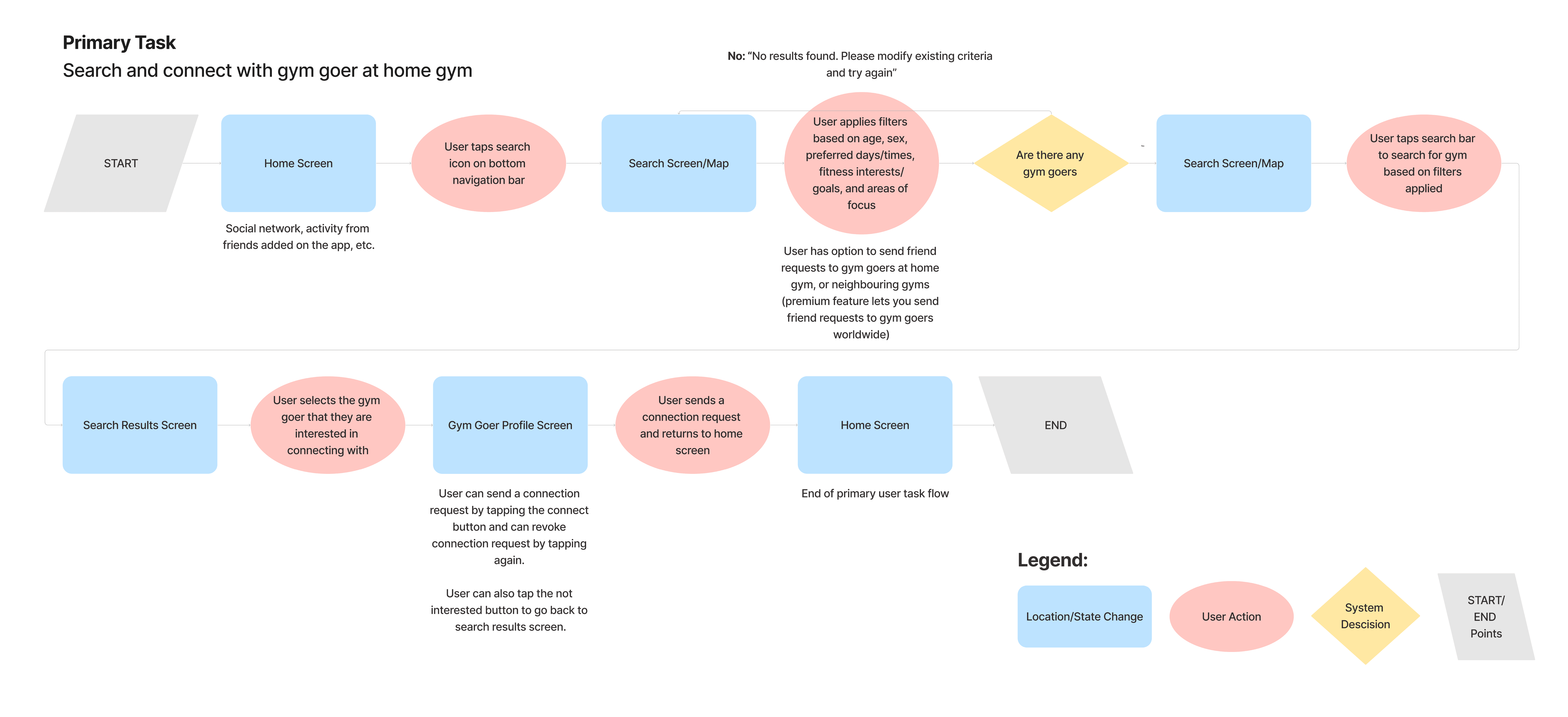
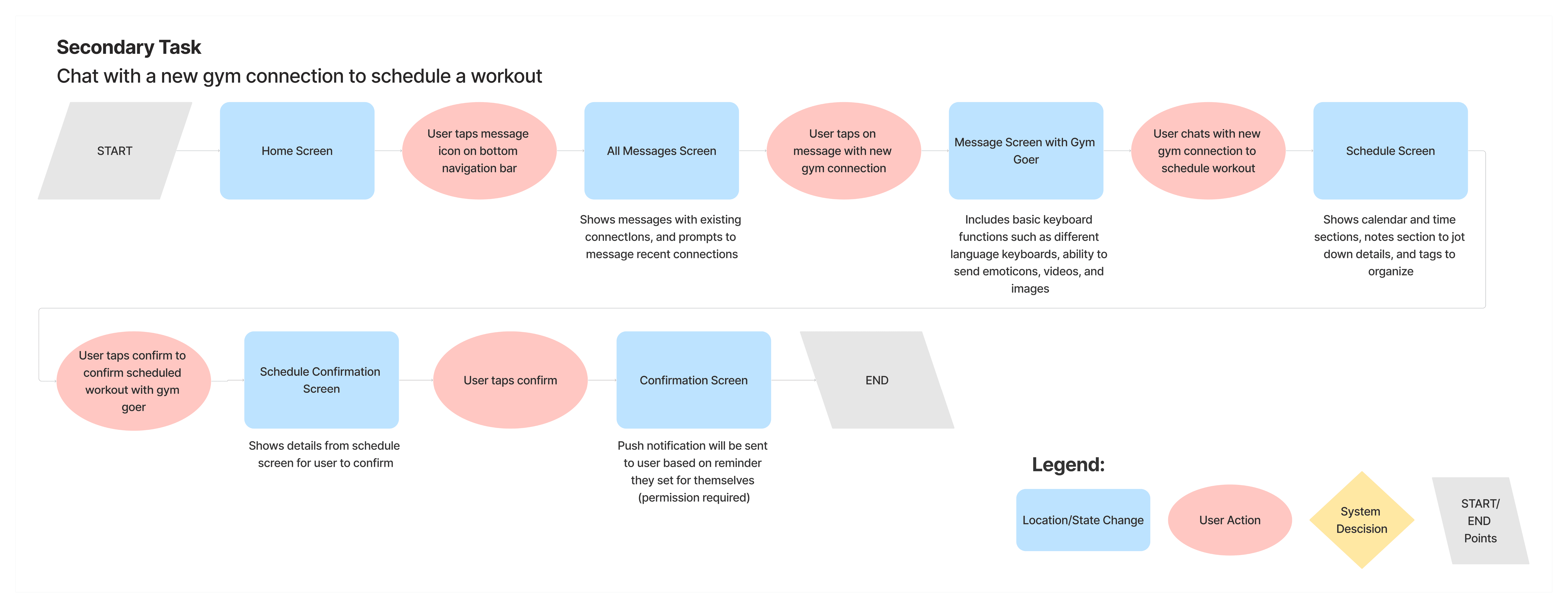
To solve the social friction I found in my research, I mapped the steps a user takes to go from working out alone to a scheduled workout with a partner. The flows prioritize clarity and safety, so every interaction feels intentional.
The primary flow covers the first introduction to social fitness. I streamlined search and filtering so users like Andrea can find compatible partners by location, fitness goals and availability, going from search to a sent request in a straight line with little cognitive load.
Once two people connect, the next step is moving from a digital match to a physical meeting. I mapped a flow for messaging and scheduling, so users can coordinate a workout and sync it to a built-in calendar.
Note on Scope: The prototype covers only the primary discovery flow. I mapped the scheduling and messaging flow, but it hasn’t been prototyped or tested yet.
Sketching
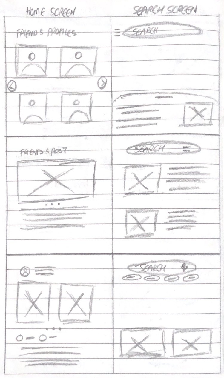
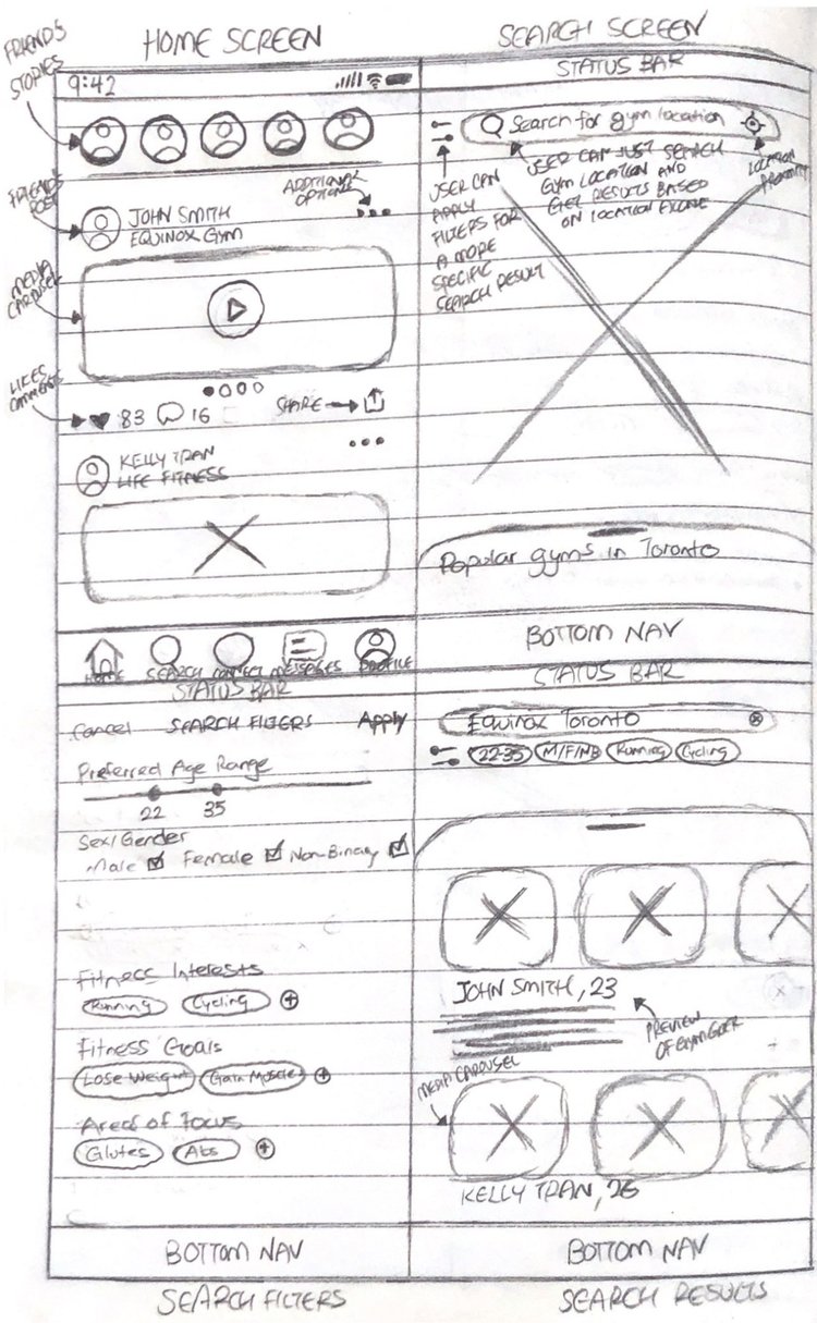
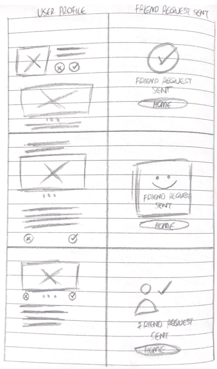
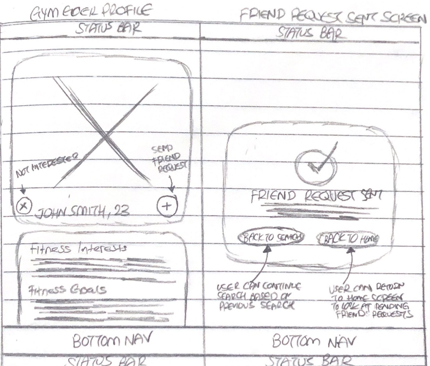
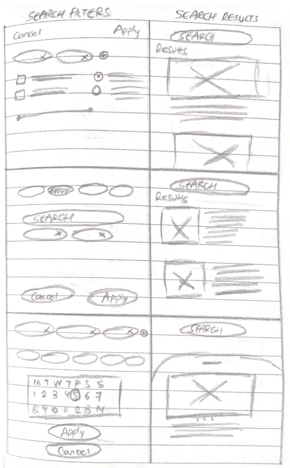
I started with low-fidelity sketches to test the app’s logic before moving to high-fidelity design. Working on paper let me explore several layouts quickly and focus on information architecture and navigation. It helped me catch friction in the user journey early, so the step from a digital match to an in-person meeting stayed simple.
Keeping the focus on structure over looks let me design around the UX principle of recognition over recall. Plain text labels and large touch targets help lower the social anxiety of the target audience. This stage refined the discovery flow into a tested framework that balances user safety with finding partners efficiently.
Wireframing
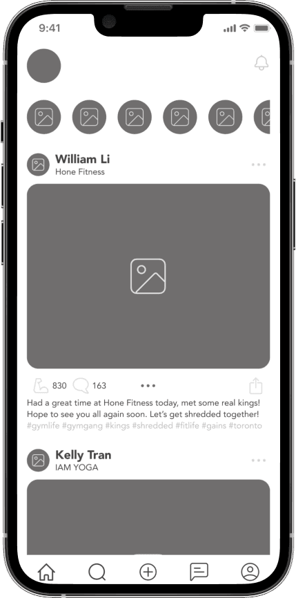
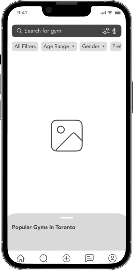
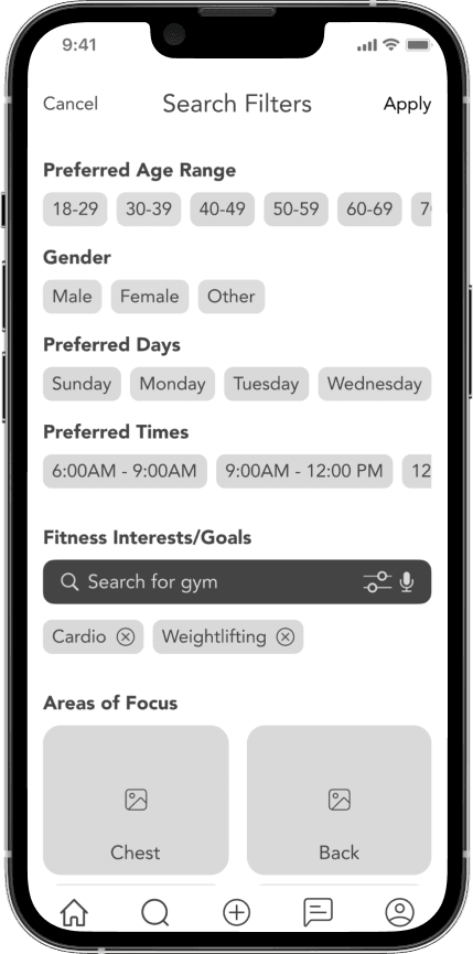
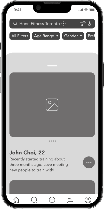
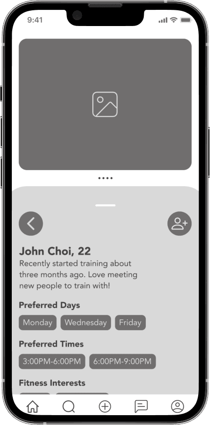
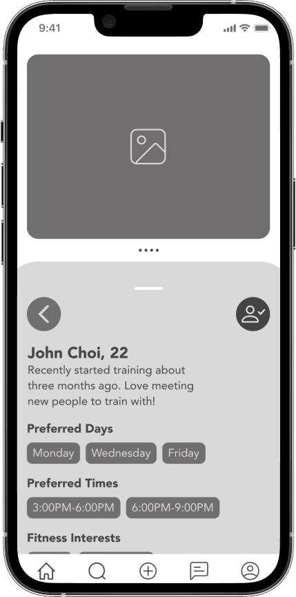
With the logic tested in sketches, I moved to digital wireframes to set the information architecture of Pullup. I aimed for a simple, low-friction interface that lets people discover others without the sensory overload common in social platforms.
Using the Familiarity Principle, I chose a standard bottom navigation bar so Search, Messaging and Profile stay within easy reach for one-handed use.
To support practical compatibility, I built a filter-first search that lets people find partners by shared fitness goals and areas of focus, not just proximity.
A clear component hierarchy puts social validation and visual progress first, with large tap targets and a balanced mix of copy and visuals so it stays easy to use in a busy gym.
Usability Testing
I planned usability testing to see how well a digital solution could ease the social friction of gymtimidation and help people build fitness connections.
I ran two rounds of testing with ten participants to check whether the app’s discovery logic worked and to find barriers for people who find in-person interactions daunting.
The sessions were qualitative and built around 13 tasks, such as setting search filters and navigating profiles. Testing showed that some of my early design assumptions didn’t match how people actually behaved.
You can view the full usability testing plan here.
Design Prioritization
After two rounds of testing, I had a wide range of feedback and possible improvements. To decide what to tackle first, I used a 2x2 Design Prioritization Matrix that sorts insights by user value versus implementation effort.
This made it clear which iterations to do first, such as reworking the placement of the like and comment buttons for right-handed users. It also flagged high-effort goals for later, like adding location prompts.
Low-impact visual tweaks moved down the list, and high-effort requests that risked scope creep, such as changing the navigation logic for “Not Interested” buttons, were intentionally put off to keep the next iteration focused.
You can view the full design prioritization matrix here.
Visual Accessibility
To move from wireframes to a high-fidelity interface, I built a design system around legibility and emotional safety. Because the target users feel anxious at the gym, the look needed to feel professional and grounding, not aggressive or over-stimulating.
Typography
I chose Avenir for its readability on mobile. Its tall x-height and distinct letterforms help people recognize content quickly in busy environments, and using several weights creates a clear hierarchy that makes profiles and data easy to scan.
Colour Palette
The palette meets WCAG 2.1 Level AA contrast standards. A deep charcoal base reduces glare under harsh gym lighting, while high-contrast white text and accent colours guide attention to key actions.
High-Fidelity Prototype
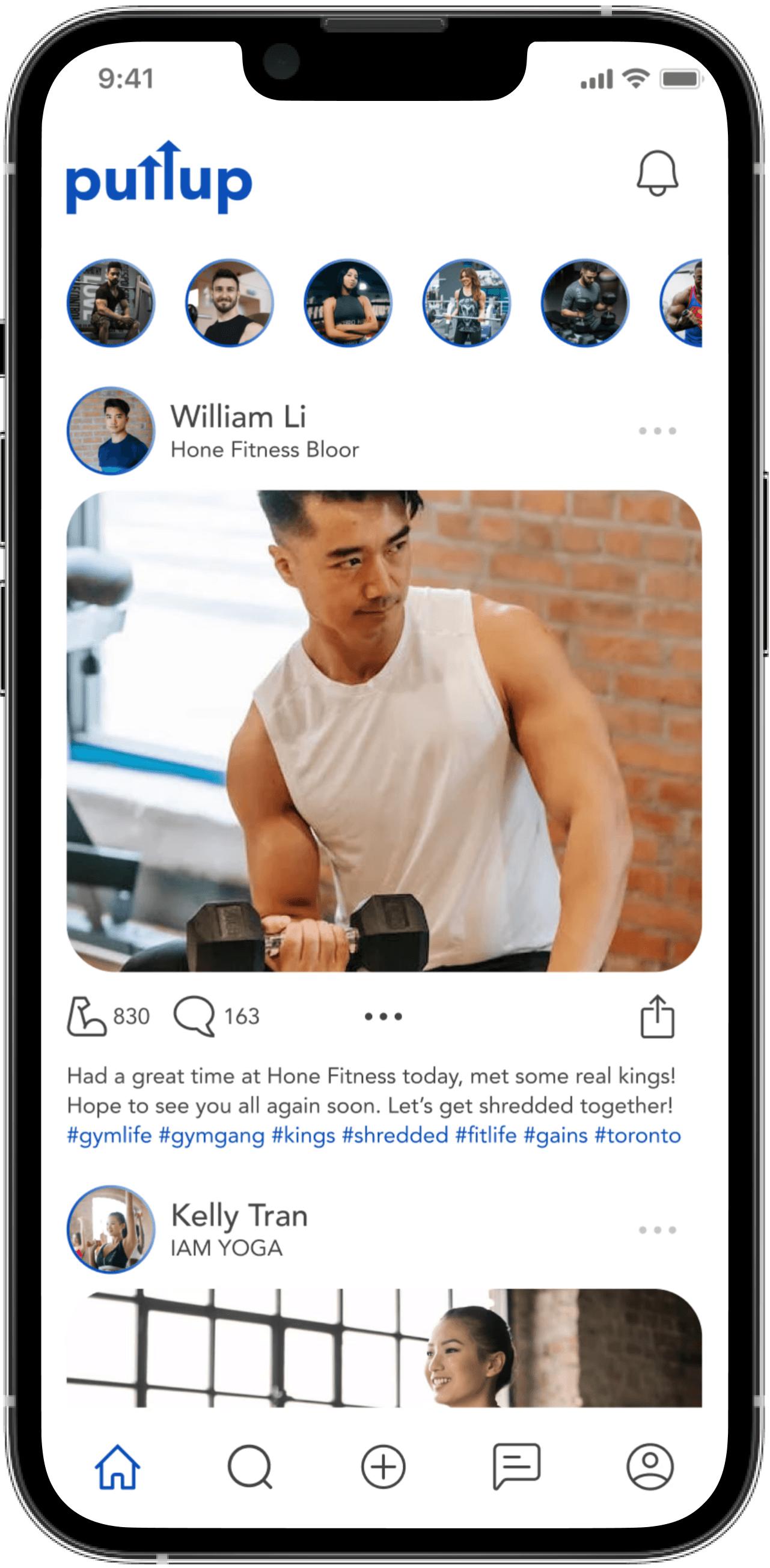
The final high-fidelity prototype brings together what I learned from research and testing. It shows how a digital connection can lead to a real-world community and helps ease “gymtimidation.”
Rather than another social media tool, Pullup treats social safety as a core feature. Clear social validation touchpoints reduce the friction of first-time interactions for people who struggle to find community at the gym.
This project followed a user-centred process, with decisions grounded in research, testing and accessibility. The result helps people find a workout partner and build the accountability and sense of belonging that keep them coming back.

Reflections
This project was a deep dive into behavioural psychology and social design. It reinforced my belief that good UX is about understanding how people feel before they even open the app.
The Power of Validation
Usability testing was the most humbling and productive phase. It reminded me to stay detached from my first drafts and let real user behaviour shape the product.
Designing for Social Safety
In social apps, privacy and security are the foundation of trust. Every decision should help users feel safe enough to be vulnerable.
Scaling the Impact
Next, I plan to focus on the coordination phase: building the scheduling system and “Smart-Match” suggestions to make the step from a digital connection to an in-person workout easier. I also want to explore “Verified Gym” partnerships for a more trusted community.