
UX/UI Case Study
IMDb
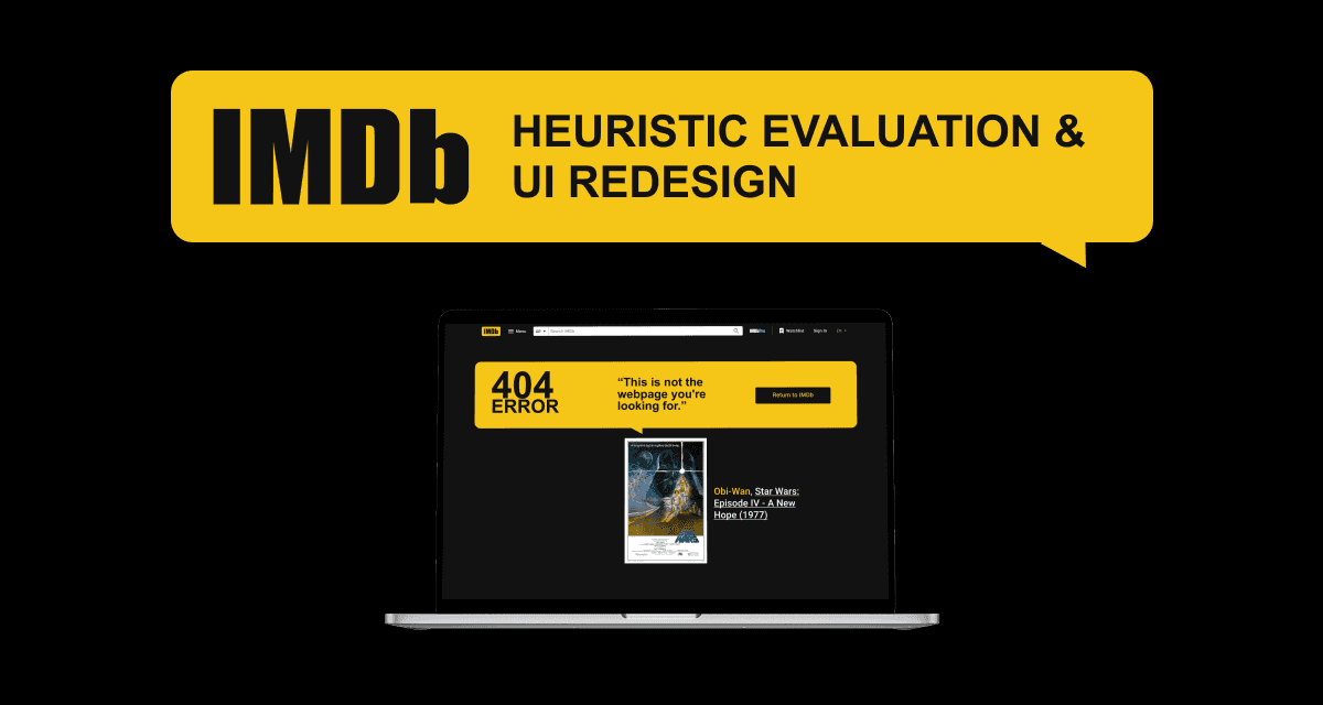
A concept redesign of IMDb’s navigation, News, Help Center and 404 pages, based on a heuristic evaluation.
Role
UX Designer & Researcher
Timeline
1 week
Team
Solo project
Tools
Figma, Illustrator, Photoshop
Problem
IMDb is a go-to source for entertainment data, but its interface is cluttered and hard to scan. This is a self-initiated concept project and is not affiliated with IMDb.
I ran a heuristic evaluation, then redesigned the navigation, News, Help Center and 404 pages to make content easier to find.
Heuristic Evaluation
A heuristic evaluation is an expert review that checks an interface against established usability principles. It doesn’t need participants.
I used Nielsen Norman Group’s 10 usability heuristics as my checklist.
Visibility of System Status
The design should always keep users informed about what is going on, through appropriate feedback within a reasonable amount of time.
Match Between System and the Real World
The design should speak the users' language. Use words, phrases, and concepts familiar to the user, rather than internal jargon.
User Control and Freedom
Users often perform actions by mistake. They need a clearly marked exit without having to go through an extended process.
Consistency and Standards
Users should not have to wonder whether different words, situations, or actions mean the same thing. Follow platform-specific and industry conventions.
Error Prevention
Even better than good error messages is a careful design which prevents a problem from occurring in the first place.
Recognition Rather Than Recall
Minimize user's memory load by making elements, actions, and options visible and recognizable from one part of the interface to another.
Flexibility and Efficiency of Use
Shortcuts hidden from novice users may speed up the interaction for the expert user so that the design can cater to both inexperienced and experienced users.
Aesthetic and Minimalist Design
Interfaces should not contain irrelevant information. Extra information units compete with the relevant units and diminishes their visibility.
Help Users Recognize, Diagnose, and Recover from Errors
Error messages should be expressed in plain language, precisely indicate the problem, and constructively suggest a solution.
Help and Documentation
It’s best if the system doesn’t need any additional explanation. However, it may be necessary to provide documentation to help users understand how to complete their tasks.
Severity Scale
I rated each problem on Nielsen Norman Group’s 0–4 severity scale so the most serious issues came first and cosmetic ones didn’t distract from them.
The scale runs from 0 (No Problem) to 4 (Usability Catastrophe), with these levels in between:
0 (No Problem)
Not a usability problem at all.
1 (Cosmetic Problem Only)
Affects visual polish but doesn’t hinder the task. Fix it only if time allows.
2 (Minor Usability Problem)
Low priority. Users can work around it with little frustration.
3 (Major Usability Problem)
High priority. It frustrates users and slows down their tasks.
4 (Usability Catastrophe)
Must be fixed before release. It stops users from reaching their main goal.
User Task Flow
I mapped the happy path for content discovery, from search to movie details, and used decision points to find bottlenecks and dead ends such as zero search results. In the redesign I removed secondary information so the flow supports one goal: deciding whether to watch. Ratings, runtimes and “Where to Watch” links are now easy to find.

UI Redesign: Main Menu
The original footer was a “mega-menu” of fragmented links, which made users work harder to find anything.
I rated it Level 3 (Major Usability Problem) because the volume of choices slowed decisions and discouraged exploration.
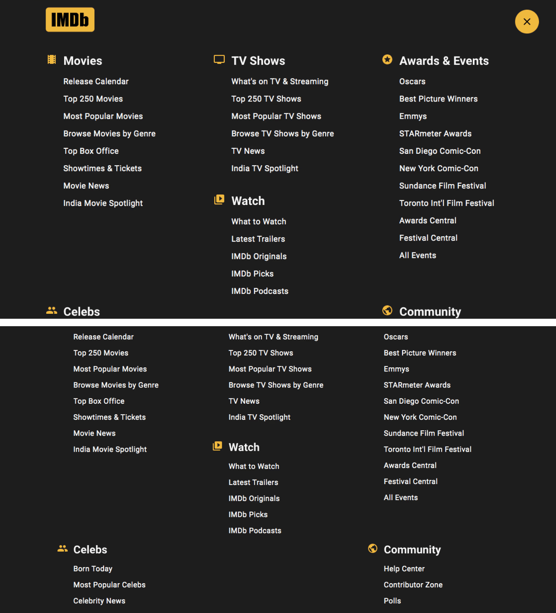
I turned the footer into a navigation hub. Secondary categories now sit inside related discovery pages (progressive disclosure), and Watchlist moves up to a primary tab.
Consistent icons and a clear active state make it predictable. This addresses Flexibility and Efficiency of Use and Aesthetic and Minimalist Design.
UI Redesign: News Section
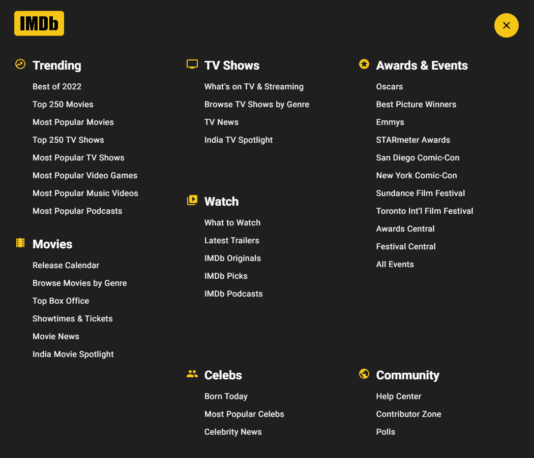
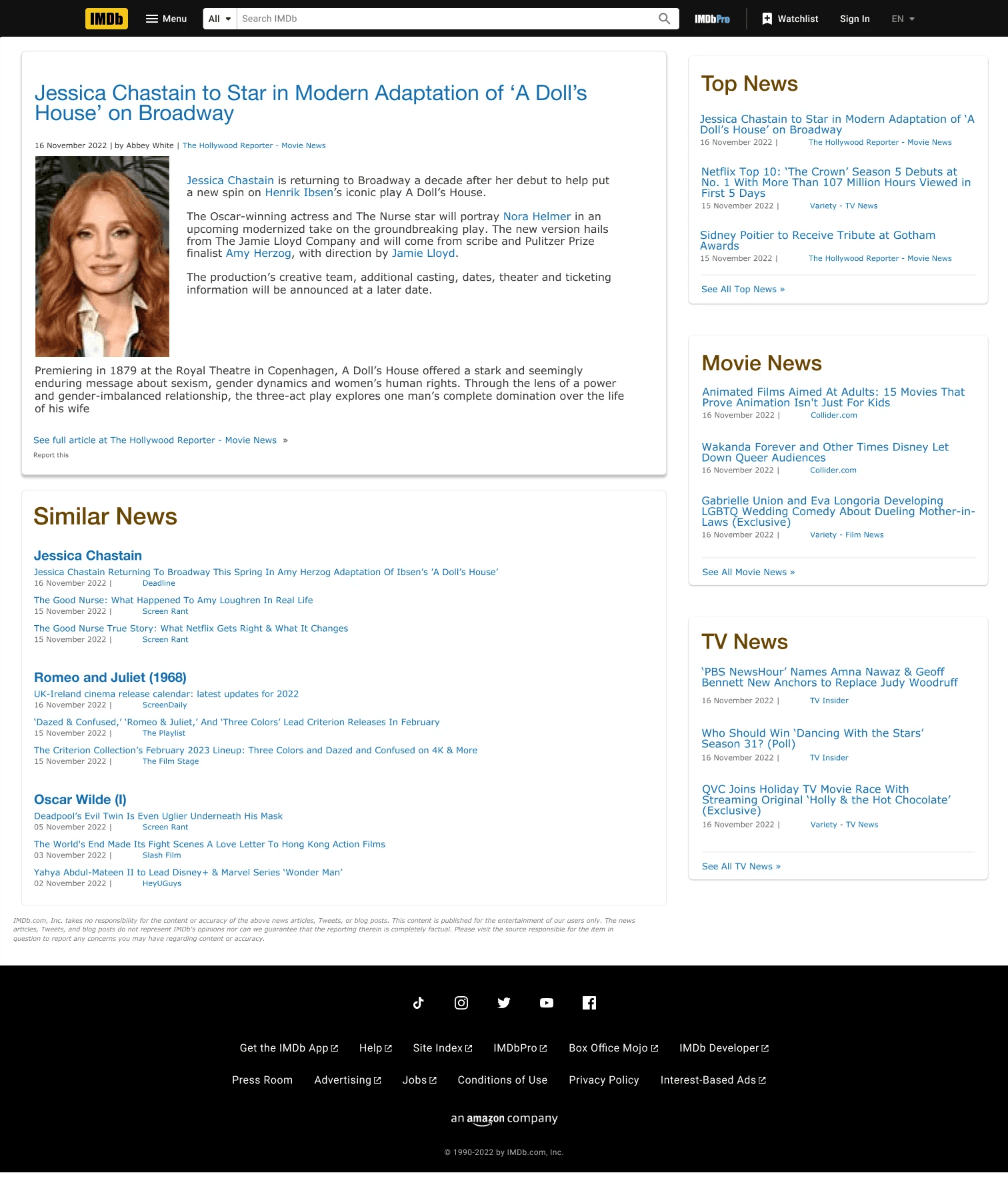
The original News feed had no grouping or type hierarchy, so it read like a raw data feed and was slow to scan.
I rated it Level 2 (Minor Usability Problem): the content was reachable, but reading it took more effort than it should.
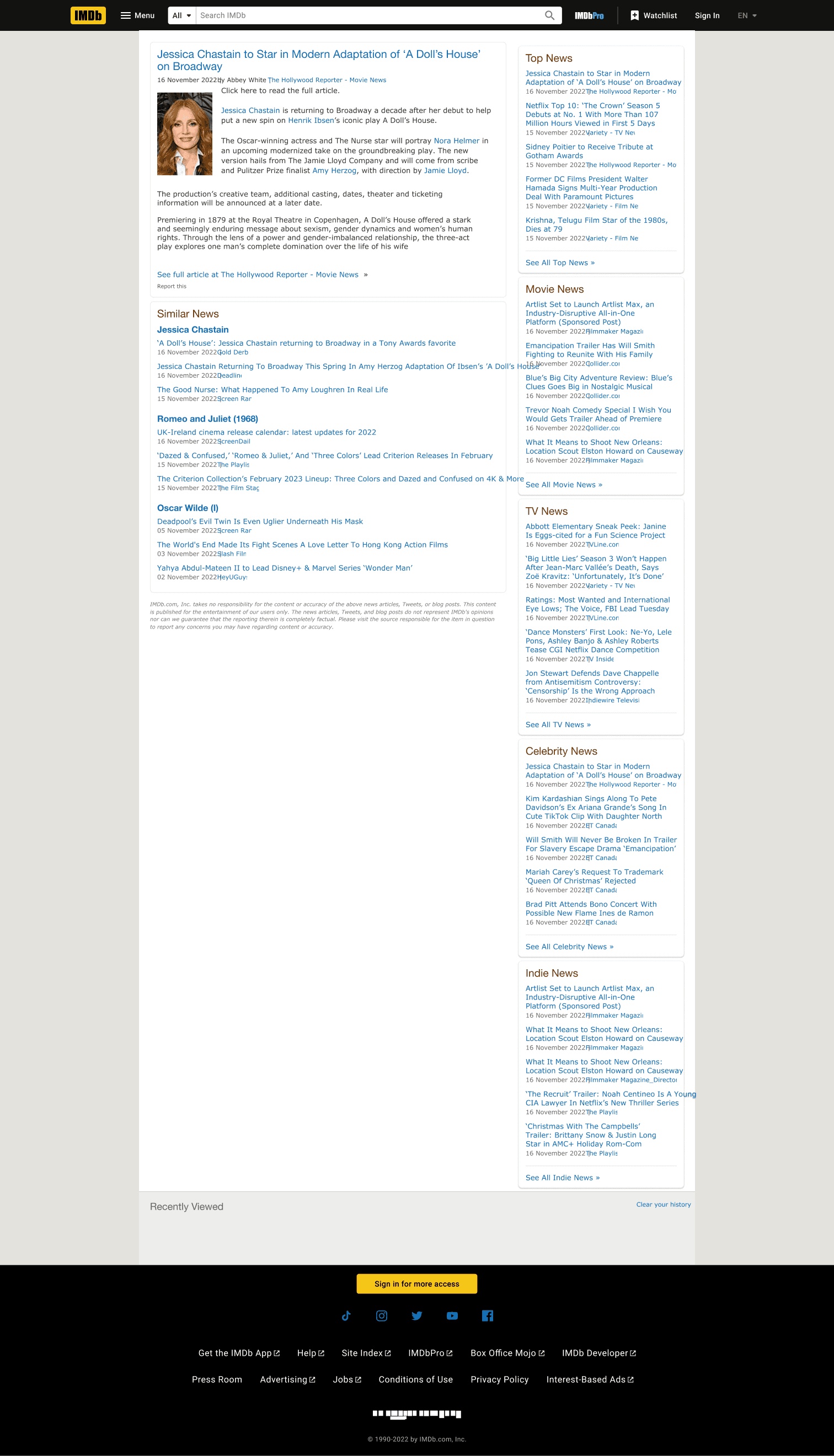
Cards now group each image, headline and timestamp. Headlines get more weight and timestamps use a secondary colour.
I added a Top News carousel, category headers so readers can filter by interest, and a Share action. This applies Aesthetic and Minimalist Design and Consistency and Standards.
UI Redesign: Help Center
The original Help Center showed every topic at once in dense text columns, which made answers hard to find.
I rated it Level 3 (Major Usability Problem) because the effort of finding help gets in the way of solving the problem.
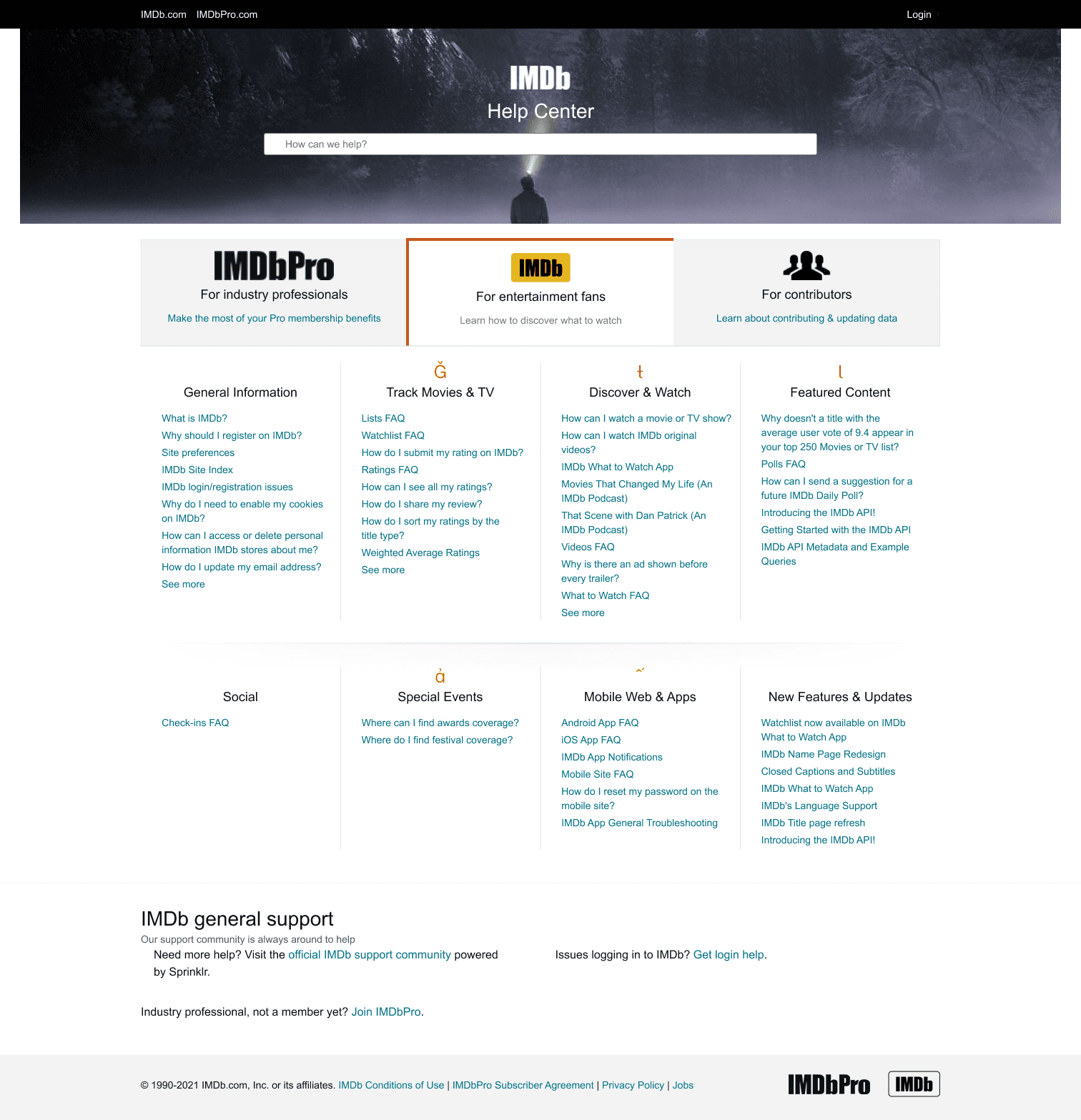
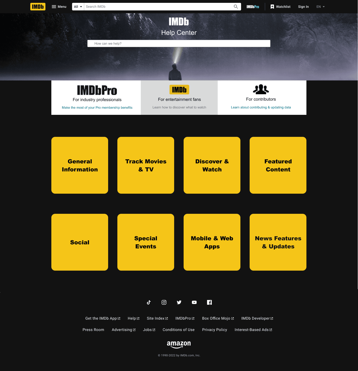
Card-based categories replace the text list, so users see a few clear starting points. I brought back the global header and footer so users can easily return to the main site. This addresses Aesthetic and Minimalist Design, Flexibility and Efficiency of Use, and Consistency and Standards.
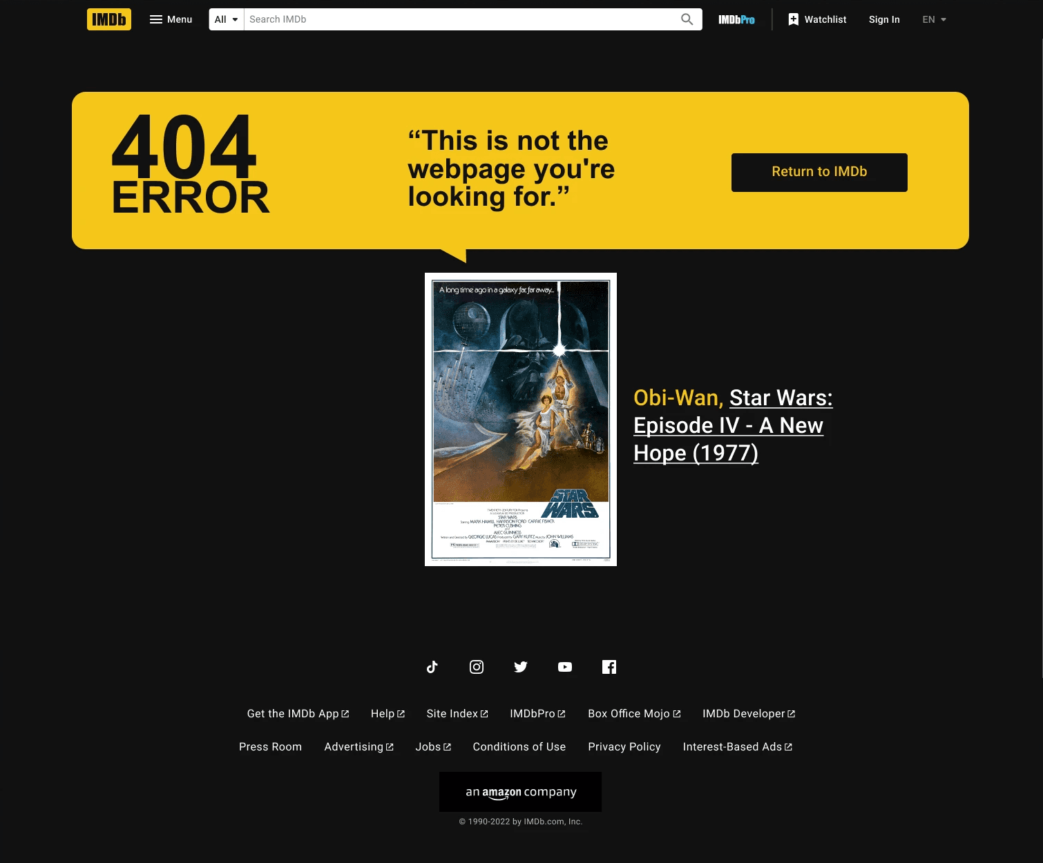
UI Redesign: Error 404
The original 404 page had no global navigation and a vague message, so users were stuck with a single home link.
I rated it Level 2 (Minor Usability Problem): it’s a secondary screen, but it’s a dead end.
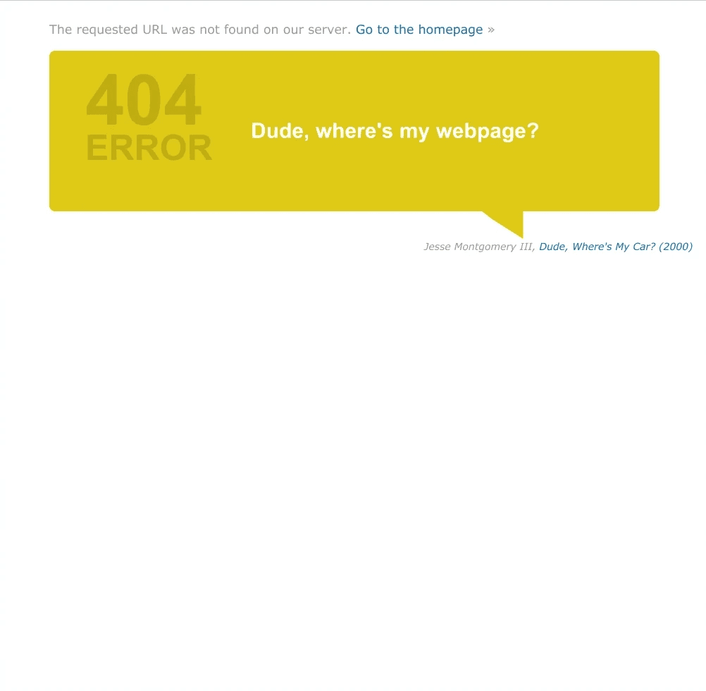
I restored the global header and footer, explained the error in plain language and added a movie-themed quote, a featured content card and clear actions such as “Return Home”. An error becomes a short detour. This applies User Control and Freedom.
Next Steps
Finding usability problems is only the first step. These are the next steps to validate the designs and move them toward a live product.
Usability Testing
This evaluation is expert-led. Next I would validate the changes with real users and run A/B tests on the revised navigation to confirm it reduces effort and speeds up content discovery.
Engineering Handoff
I would work with developers to check the technical feasibility of the changes, so the design stays scalable and the new components fit the existing architecture.
Performance Monitoring
After launch, I would use heatmaps and analytics to track session duration, click-through rate on the redesigned components and search success rate. That data would guide continuous refinement.
Reflections
Redesigning a platform this data-dense and iconic meant balancing legacy with modernization.
Interfaces Collect Clutter
Even the most successful platforms pile up noise over time. A systematic heuristic audit strips it back and returns the focus to what users need.
Prioritization Is a Design Skill
Not every issue needs an immediate fix. The severity scale taught me to focus effort where it helps users most.
Minimalism Is Functional
In a data-heavy app, minimalism is a functional necessity, not just a look. This project strengthened my use of progressive disclosure to keep information rich without overwhelming people.