
UX Case Study
Google Kandula
A web dashboard that helps seniors with early-stage Alzheimer’s relearn everyday websites through repeatable on-screen prompts.
Role
Lead UX Designer
Timeline
24-hour hackathon
Team
Team of 4
Tools
Figma, FigJam

Problem
This project came out of a Google-sponsored industry hackathon. Our team of four had 24 hours to design a solution that improves access to information, education and digital tools for underserved communities.
We focused on seniors in the early stages of Alzheimer’s. Many never built digital skills earlier in life, and now face interfaces designed for digital natives while also managing short-term memory loss and slower processing. The result is digital isolation, where even basic tasks like getting online cause frustration and fatigue.
Solution
We set out to help people with Alzheimer’s feel more independent when using online services. Our solution, Google Kandula, is a web dashboard that lets users relearn everyday interactions on their favourite websites through repeatable on-screen prompts, and resume where they left off by tracking their last known progress.
Results
🥈 Runner-up out of 14 teams in a Google-sponsored hackathon, with stakeholders highlighting its strong user focus and accessible design.
🤝🏻 About 90% of the people we tested with, all interviewed at the hackathon, found the navigation intuitive and completed tasks without assistance.
Research Through an Empathetic Lens
With only 24 hours, our research was driven by empathy. Quantitative data gave us the demographic foundation, and some of our team members who are primary caregivers for people with Alzheimer’s added firsthand insight.
That helped us look beyond generic accessibility standards to the hidden friction points of cognitive decline. We didn’t only look for ease of use; we looked for cognitive safety. It also shaped our map of the emotional journey for a user who missed the digital revolution and now faces interfaces that depend on recall rather than recognition, a major failure point for people with short-term memory loss.
Secondary Research
Our secondary research helped us understand our target users, people with Alzheimer’s disease. It validated the “why” behind our design decisions and highlighted the cognitive barriers and shifts in dependence our users might face, all grounded in empathy and inclusive design.
Digital Scaffolding
Higher technology use is associated with a 58% lower risk of cognitive impairment in adults over 50. (Benge & Scullin, 2025)
Invisible Caregiving
Nearly 12 million U.S. caregivers provided more than 19 billion hours of unpaid dementia care in 2024. (Alzheimer’s Association)
Majority Are Women
Women make up the majority of people living with dementia, because prevalence is higher in women than in men. (ADI)
Competitive Analysis
To ground our solution in reality, we ran a sentiment analysis of reviews of existing Google accessibility features. We wanted to see where current standards fail the cognitive needs of users with Alzheimer’s, so we synthesized a large set of negative reviews to find the main challenges.
Discovery Gap
Accessibility tools are often buried in nested menus. For a user with short-term memory impairment, the effort of finding and turning on a support feature can stop the experience before it begins.
Performance Instability
Accessibility overlays often caused lag or crashes, likely from heavy processing or unoptimized code. For seniors, a frozen screen isn’t just a bug; it causes confusion and anxiety, and leads to abandonment.
Lock-In Effect
Confusing settings and unclear exits can leave users stuck in an accessibility mode they don’t want. Without a clear way to reverse an action, they lose the confidence to explore.
Defining the Cognitive Landscape
We couldn’t test directly with people who have Alzheimer’s. To stay grounded, we used a constraint-based design approach and mapped our features to the main clinical symptoms of early-to-mid-stage dementia. That moved us from designing for seniors to designing for cognitive support.
Short-Term Memory
Not recalling recent events means any flow that needs a multi-step mental model will fail. We added always-visible navigation and contextual breadcrumbs so users always know where they are and how they got there.
Repetition Loop
People with Alzheimer’s often repeat questions because the link between short-term and long-term memory is disrupted. We added a feature that logs previous interactions like a checkpoint, confirming progress without making users restart.
Processing Latency
Tasks take longer not because of physical speed but because of the cognitive load of decoding complex interfaces. We prioritized recognition over recall with literal, high-contrast icons and removed non-essential decorative elements that add visual noise.
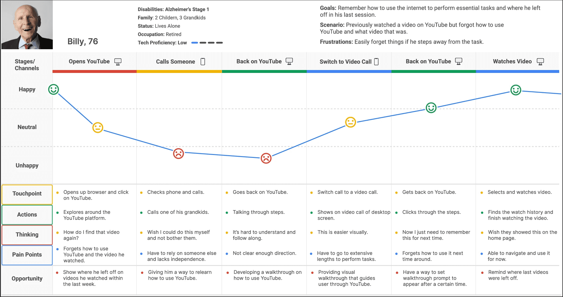
User Persona

Billy Bennet, 76
Retired Librarian & Community Volunteer
"I’ve always taken pride in handling my daily tasks on my own, but lately, the world feels like it’s moving faster than I can keep up with. I just want to be able to handle my time on the Internet without feeling like I’m failing a test every time I get on the computer."
Pain Points
High drop-off rates from task interruptions.
Inability to convert short-term interactions into long-term muscle memory.
Frustration and anxiety from interaction looping.
Needs
Persistent visual cues that guide user flow without requiring memory of the previous steps.
Zero-jargon descriptions that focus on the outcome of the function.
Ability to calibrate and personalize their user experience to their needs.
Behaviours
Only engages with digital platforms when assistance is available due to fear of irreversible technical errors.
Relies on physical notetaking to bridge the digital gap.
Gravitates towards interfaces that mirror the physical world.
Emotional Journey Map
To visualize Billy’s experience, we mapped his emotional and cognitive state across a standard task flow. The goal was to find where memory failure leads to emotional distress, and where visual learning interventions could bridge the gap.
Phase 1: The Recognition Gap
At the start of the task, Billy meets an interface that depends on recall rather than recognition. With no visual cue to jog his memory, he stalls, and early confusion begins to build into frustration.
Phase 2: The Dependency Pivot
As frustration peaks, Billy shifts from exploring on his own to seeking help from others. This is an emotional low point, where the technical gap turns into social shame and a loss of autonomy. It points to an opportunity for a self-service support layer that replaces verbal instructions with persistent visual cues, easing the load on his support network.
Phase 3: The Synthesis Breakthrough
The mood shifts toward relief as Billy moves from abstract navigation to following a visual walkthrough. This supports our core hypothesis that for people with Alzheimer’s, recognition over recall is the most viable path to success. A real-time visual overlay lets Billy complete complex tasks by following what he sees rather than memorized steps.
Phase 4: Empowerment & Validation
The journey ends with a restored sense of independence. Completing a task offers more than its practical result: it validates Billy and eases the fear of “breaking the technology.” This is the most important phase, because it shows the design moved the user from digital isolation to confident, independent use.
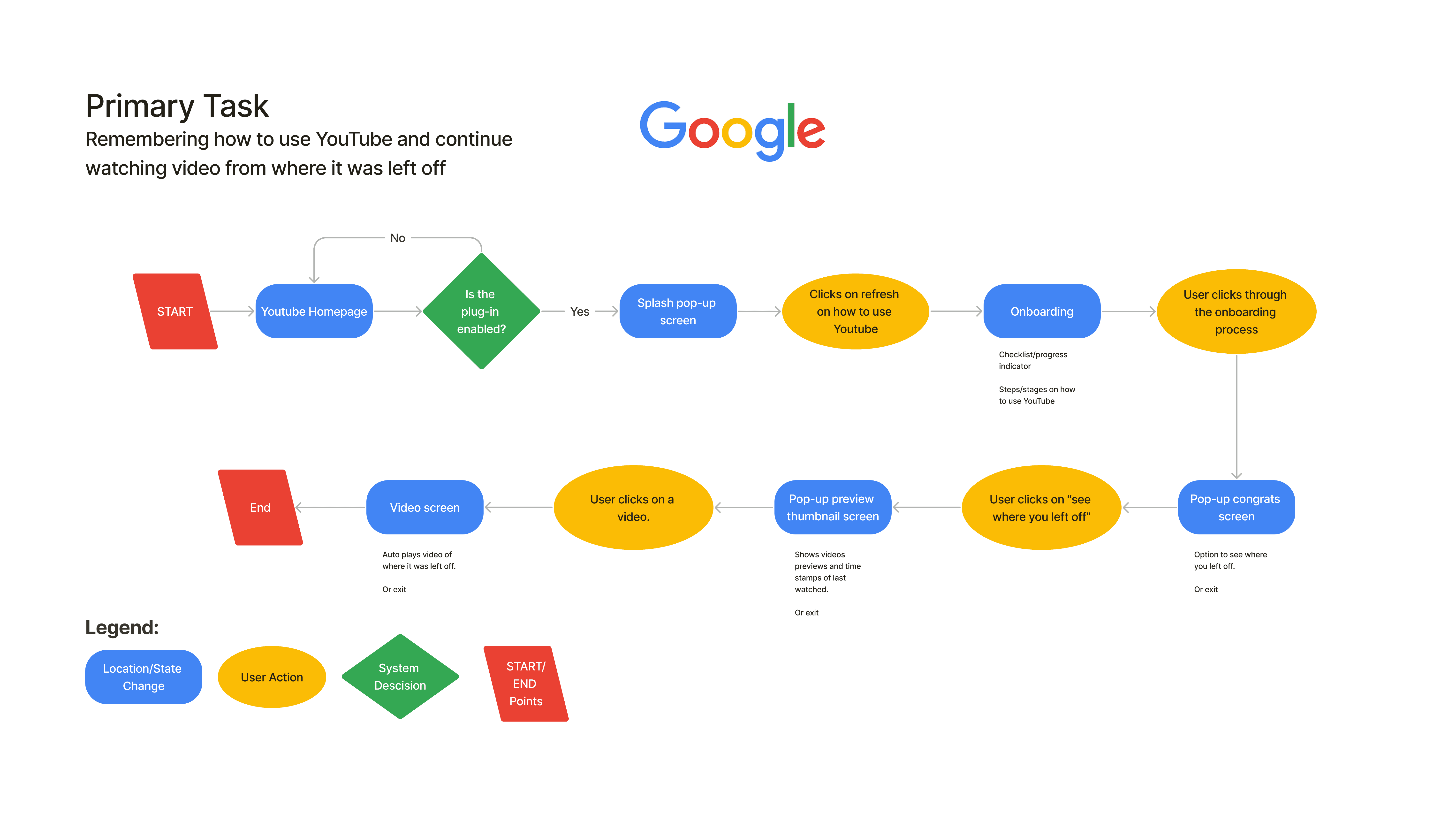
Task Flow Analysis
To address the friction of recall failure, we designed a task flow built around recognition-based navigation. Rather than leaving users to follow a set of instructions alone, it is a guided journey between the system and the user, so the burden shifts from the user to the interface.
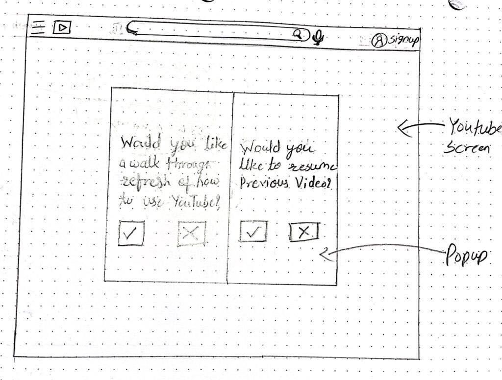
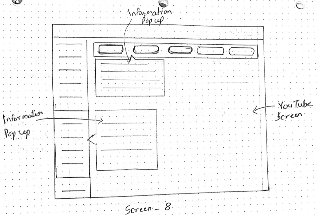
Sketching the Experience
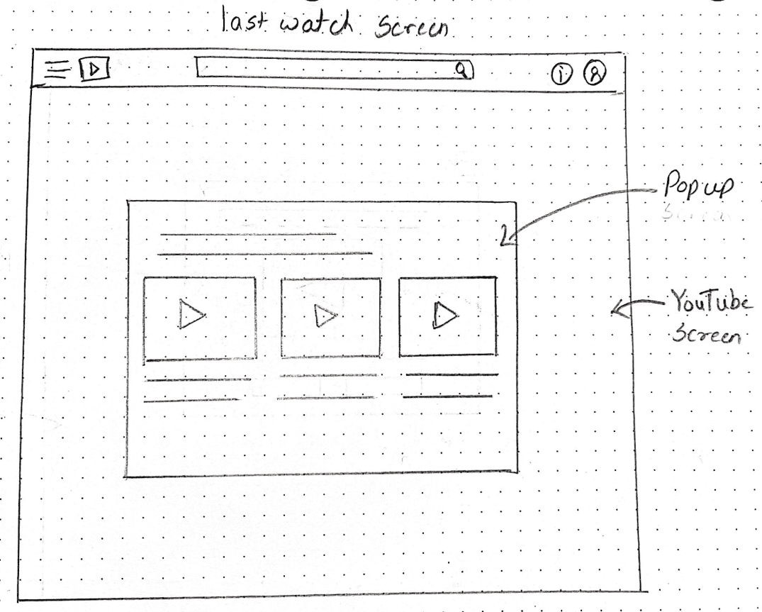
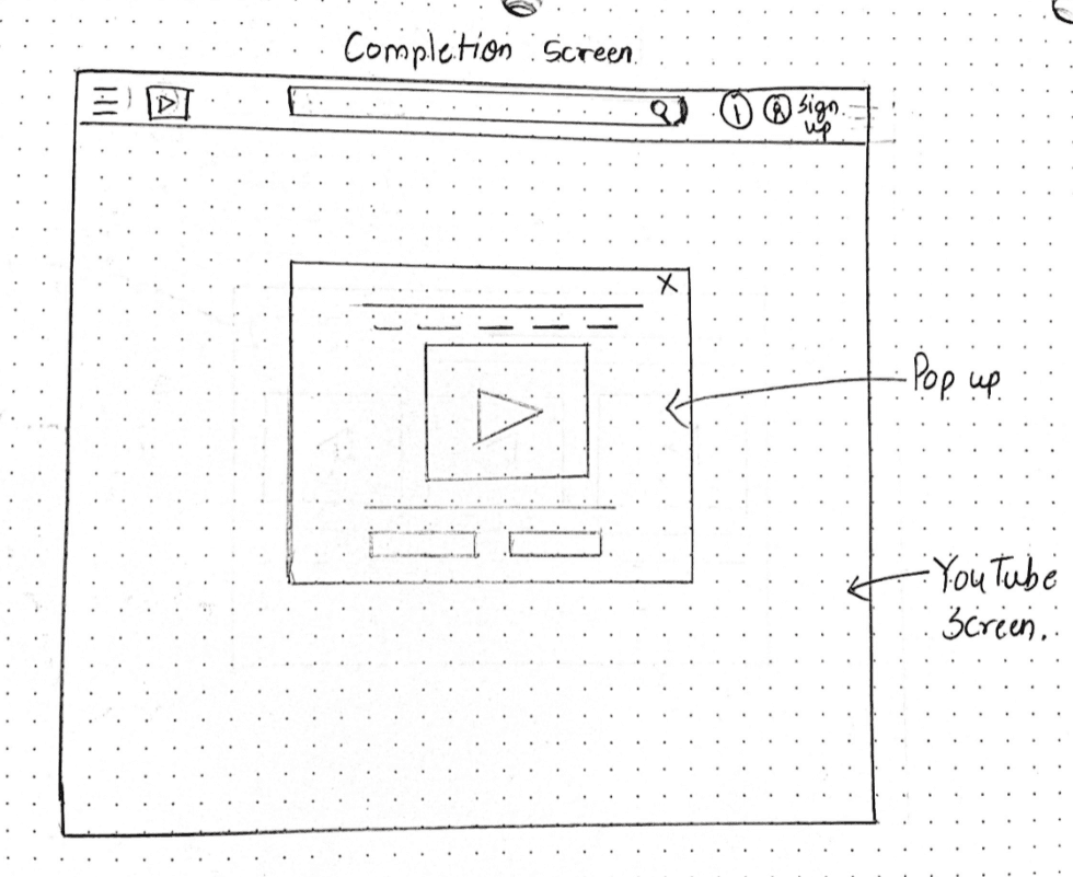
We used sketching as a low-fidelity way to test our hypothesis. Working on paper let us iterate quickly on component placement, especially how to overlay a simplified support layer on a complex existing platform without adding confusion.
We experimented with modal positioning so support features are hard to miss but not intrusive, appearing at the moment they are needed. We also mapped the spatial relationship between the help overlays and the content underneath, so the transition felt like part of the platform rather than a disruptive pop-up.
Wireframing
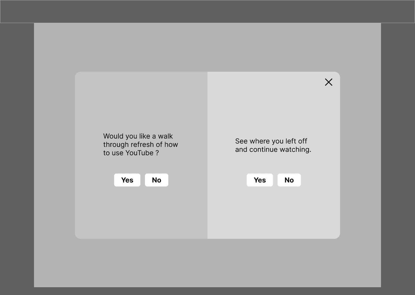
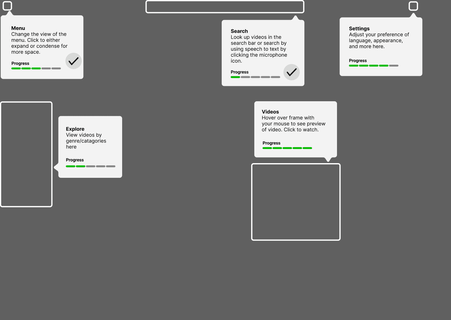
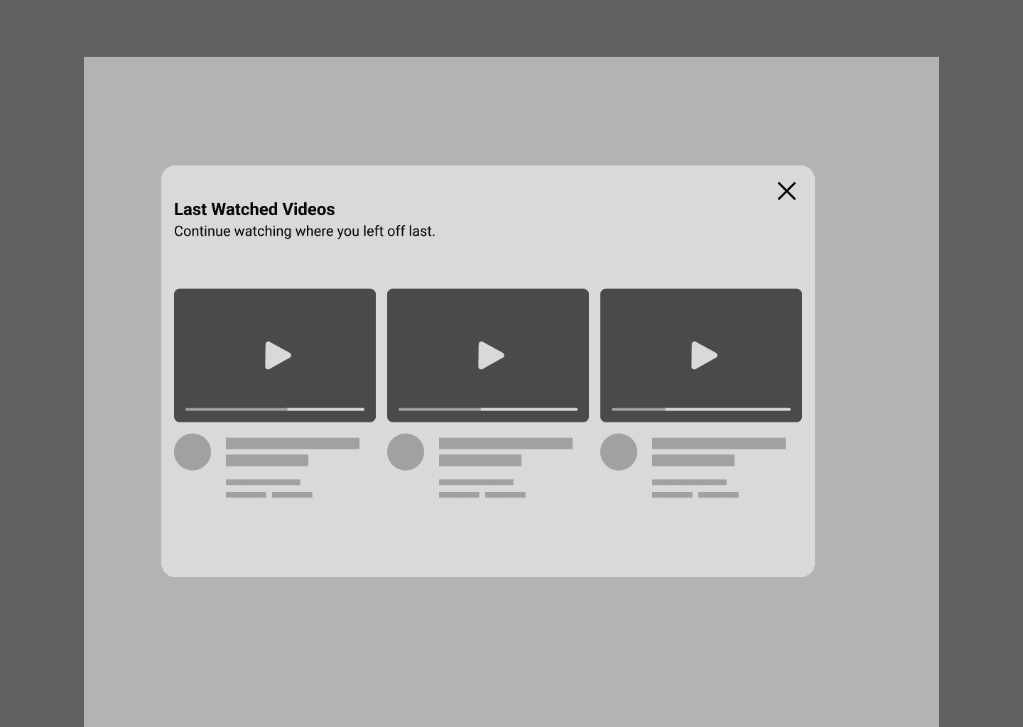
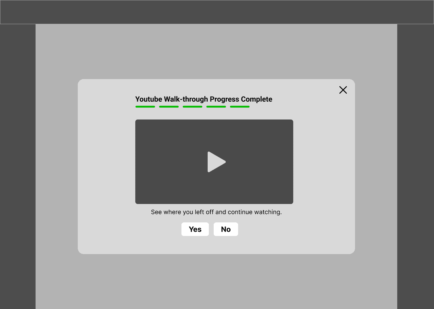
Moving from sketches to wireframes let us set a clear information architecture for users with Alzheimer’s. By stripping away imagery and colour, we could focus on spatial consistency and clear affordances in the support overlays, giving users a sense of “digital safety.”
We focused on cognitive safety to reduce interaction cost and sensory overload. We used a simple two-option modal with high contrast and minimal decision-making to narrow the user’s attention, paired with persistent progress cues that act as an external memory aid. With optimized touch targets and explicit, literal text instead of abstract icons, we shifted the experience from high-recall effort to recognition, so every element works as a visual cue.
High-Fidelity Prototype
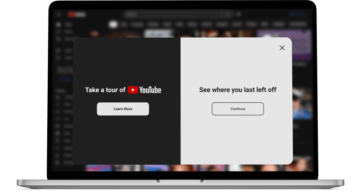
In the final phase, I led the translation of our wireframes into a high-fidelity prototype that follows Google’s Material Design 3 system with added accessibility modifications. The visual design was more than aesthetics: colour and typography choices were made to improve legibility and reduce the stress of getting lost in an interface.
Reflections
Designing for Cognitive Safety
Beyond standard WCAG accessibility, this project taught me to design for the user’s emotional state. We found that for people with Alzheimer’s, the main barrier isn’t only a lack of skill but the psychological friction of feeling incapable. By designing cognitive guardrails, we shifted from a user failing the interface to an interface that actively supports the user.
The Value of Evidence-Based Design
Our only testing was informal, with people we interviewed at the hackathon, so there was no long-term user testing. We relied on our team members’ firsthand caregiving experience and our secondary research. That reinforced my belief that designers must be both researcher and advocate: grounding decisions in how memory loss works moved us from guessing to problem-solving. Next, I would validate the design with real users.
Scalability and a Voice-First Future
If given the opportunity to iterate further, I would move toward a multi-modal ecosystem. While our visual overlays provided a strong cognitive bridge, integrating voice user interfaces (VUI) would allow a hands-free experience that reduces the motor-skill demands on seniors. This project reinforced that true inclusion isn’t about adding features; it’s about removing the barriers that keep people from connecting.