
UX Case Study
Blessings
A mobile giving app that makes tithing consistent, transparent and joyful for churchgoers.
Role
UX Designer & Researcher
Timeline
2 weeks
Team
Solo project
Tools
Figma, Illustrator, Photoshop
Problem
Many churchgoers want to tithe and donate faithfully but struggle with inconvenient methods (cash, cheques, multiple platforms), lack of transparency (where funds go), and forgetfulness (missing recurring gifts). Churches, in turn, face inconsistent donations and administrative burdens from manual tracking.
How might we design a mobile app that simplifies recurring donations while fostering trust and ease of use?
Solution
Blessings is a mobile giving app with one-tap donations, recurring gifts and clear visibility into where money goes, so people can give joyfully and see their impact.
I designed it around one idea: giving should feel like worship, not a chore.
Research and Findings
Before designing, I wanted to understand what makes tithing hard: the challenges, emotions and habits of churchgoers. The research below shaped the key features and tested my assumptions.
Secondary Research
I started with industry data and articles on why consistent giving is hard in modern churches.
Three findings shaped my assumptions.
Church Loyalty
77% of donations come from just 10‑20% of churchgoers. (Nonprofits Source)
Digital Shift
60% of church donations are now made digitally. (Nonprofits Source)
Recurring Habits
Recurring giving increases donor retention by 42%. (Nonprofits Source)
Barriers to Consistent Tithing
Research points to three friction points: forgetfulness, distrust of digital platforms and inconvenient processes.
Many church apps make this worse with multi-step logins, no recurring-payment default and little visibility into where funds go. Cash-reliant givers, especially older ones, are also unlikely to switch without clear onboarding.
Primary Research
I interviewed six people from churches across the Greater Toronto Area, in person and over Google Meet. Each 30-minute session used open-ended questions about how and why they give. Three obstacles stood out.

Every Sunday, I tell myself that I will remember to get cash. But I always end up forgetting while between getting ready and rushing out the door.

How do I know my money actually helps my church? If I knew where exactly my money went, I’d give more joyfully. Right now, I just hope it’s used well.

I've been tithing with cash for years now. I know the church says it’s safe to tithe digitally, but it’s hard to trust something I can’t hold in my hands.
The Cash Reliance Dilemma
Many churchgoers juggle work and family and forget cash or cheques on Sundays. Giving is a spiritual commitment, so missing it brings guilt. I designed a one-tap donation flow with recurring options so tithes can run automatically. The app defaults to the user’s home church and suggests preset amounts to reduce decision fatigue.
The Transparency Gap
Donors often don’t know how their money is used, so they hesitate to give more or designate funds. I added real-time progress tracking for urgent causes, so donors can see others contributing toward a goal, plus a short description of each fund’s purpose. Giving becomes a connection to the church’s mission instead of a leap of faith.
The Digital Hesitation
Older congregants often prefer traditional giving. They worry about security and mistakes, or feel an app lacks the reverence of an offering. I used familiar metaphors, biometric sign-in and accessibility guidelines to ease the shift, and framed the app as a tool for easier faithfulness, not just convenience.
User Persona

Tiffany Day
Creative Director & Design Mentor
“I love supporting my church, but being constantly on the road with work, I need giving to fit my life. If I could do it all from my phone—and actually see the difference—I’d give more joyfully."
Pain Points
Forgets to bring cash/cheques on Sunday’s.
Unable to attend in-person services consistently.
Unsure how tithings are allocated.
Difficulty keeping track of tithings.
Goals
Simple, fast, and secure giving.
Knowing where funds are allocated.
Build a consistent tithing routine.
Share tithing activity with others.
Behaviours
Exclusively uses mobile apps due to job nature.
Likely to tithe more during church holidays or in person.
Prefers recurring tithing to avoid forgetting.
Enjoys talking about her contributions to friends and family.
User Task Flow
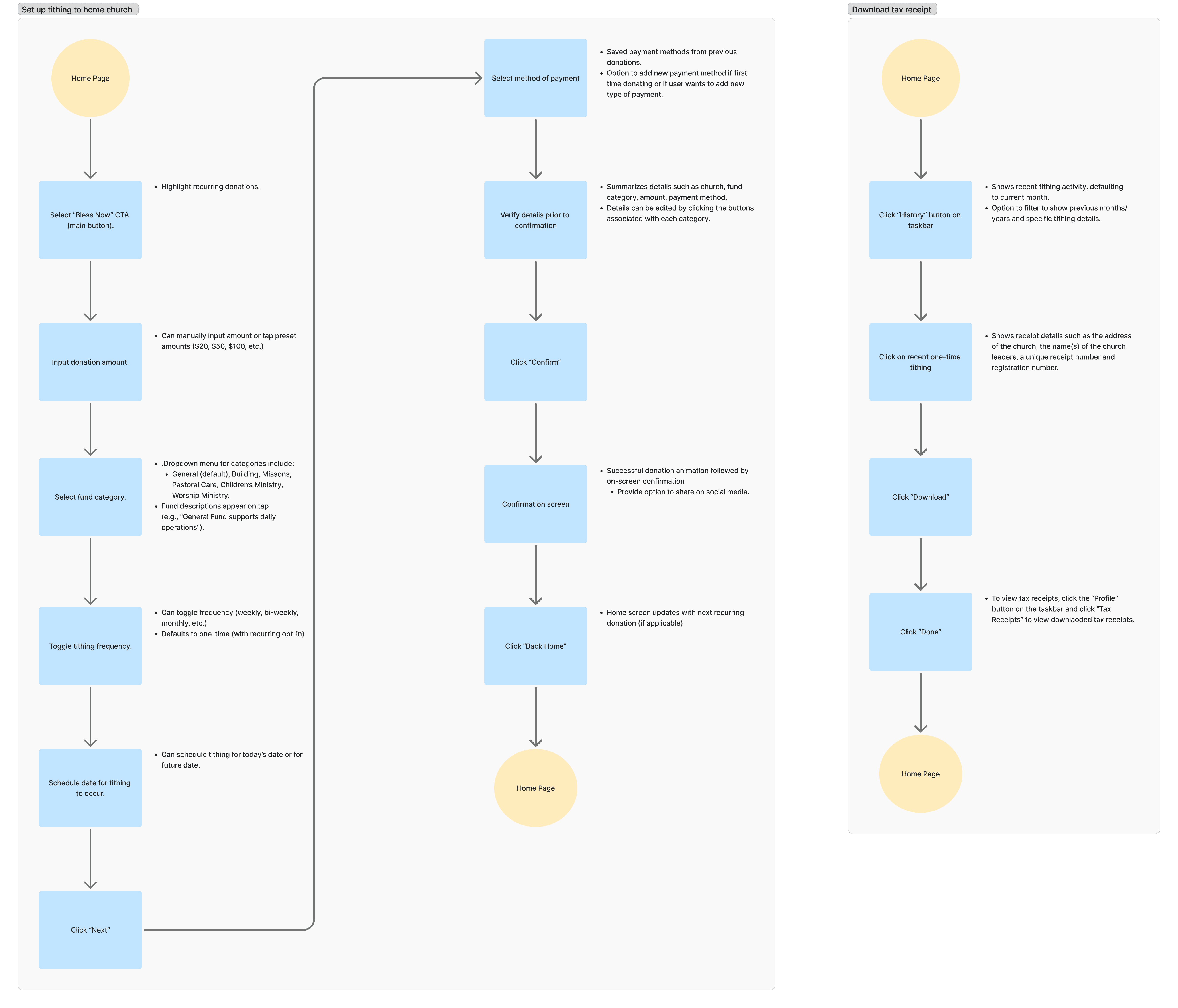
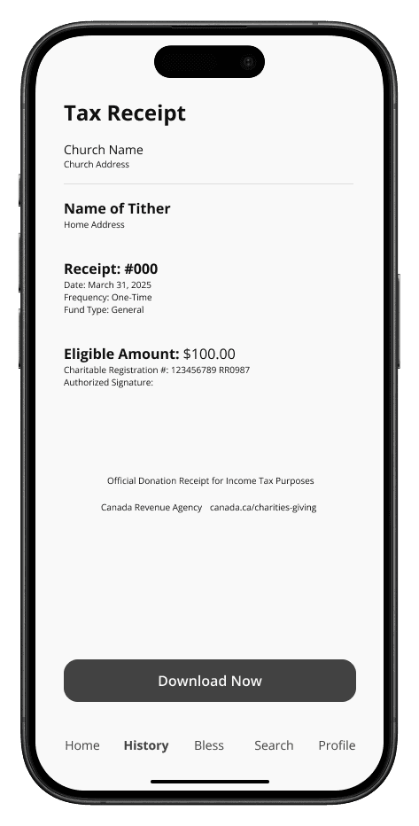
The flow covers two high-intent paths: donating, and retrieving a tax receipt afterwards.
Both start from the Home page and move through short, linear steps to keep the mental load low.
Wireframing
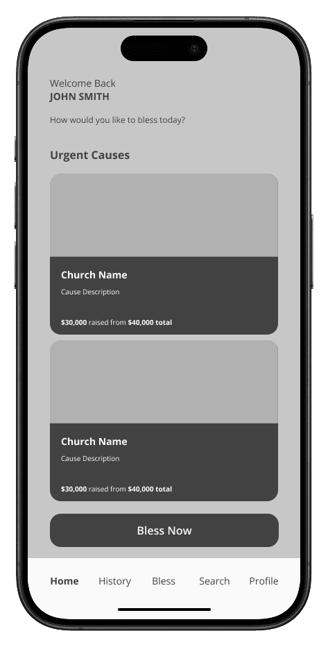
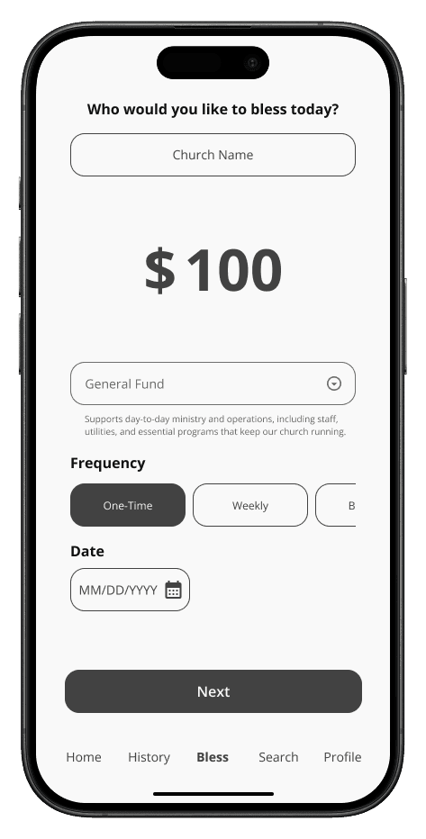
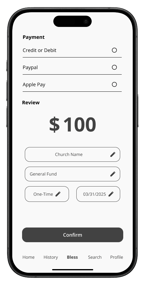
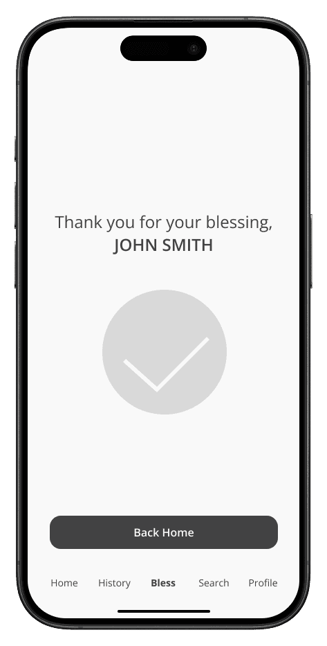
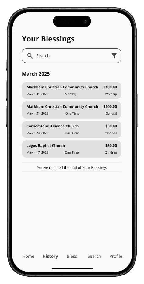
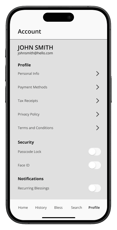
I centred the design on three goals: convenience, transparency and consistency. The aim was to turn tithing from a rigid financial transaction into a moment of community connection. Emotive UX writing and deliberate friction make each gift feel intentional, and utilities like instant tax receipts and automated giving add everyday value.
The result is a minimal, low-friction interface with high-trust features like real-time cause tracking and biometric security.
Iterations
Round one tested low-fidelity wireframes to validate core flows before investing in high-fidelity design. Testing early kept iteration fast and surfaced foundational issues before visual polish.
Three reasons I tested this early:
Function Over Aesthetics
Without colour and images, testers focused on completing tasks rather than judging the visuals.
Structural Flaws Surface Early
Testing exposed navigation gaps that would be costly to fix after development.
Honest Feedback
People critique rough wireframes more freely than polished designs, which often get polite but less actionable feedback.
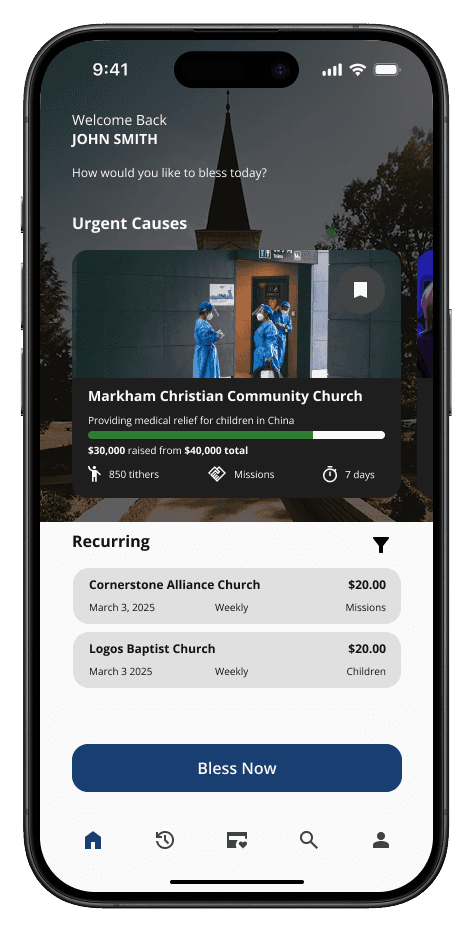
Static cause descriptions became a dynamic feed with progress bars and time-sensitive indicators, giving donors the direct impact feedback they asked for.
I also added a recurring-gifts module so existing commitments stay visible, nudging giving from one-off to habit.
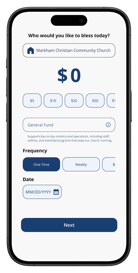
I added preset amount chips beside the manual field, based on common tithing amounts. One tap skips the keyboard and gets users to checkout faster.
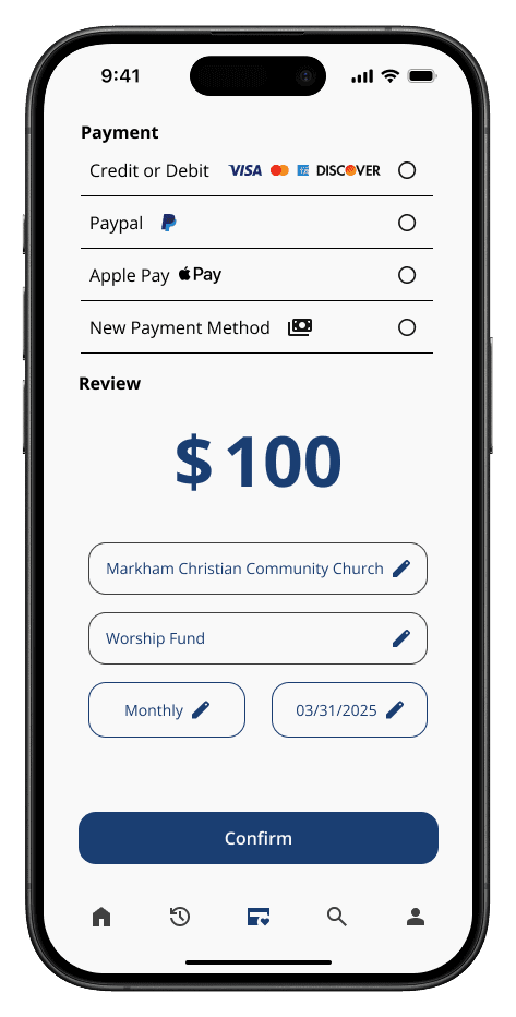
I expanded the payment section beyond a static list with a “New Payment Method” button and recognizable card and wallet icons, so users can manage several funding sources.
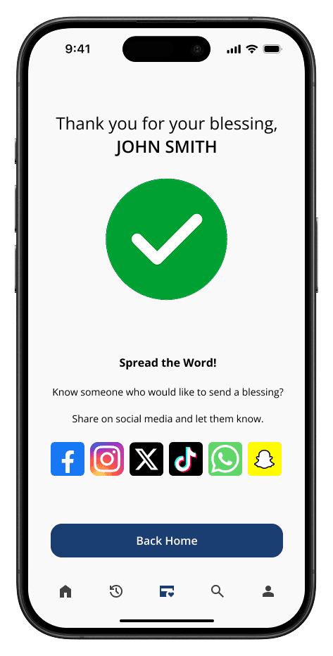
A standard confirmation screen was a dead end, so I added a “Spread the Word” module with social sharing. It turns a private receipt into a public invitation and reinforces the emotional reward of giving.
Usability Testing
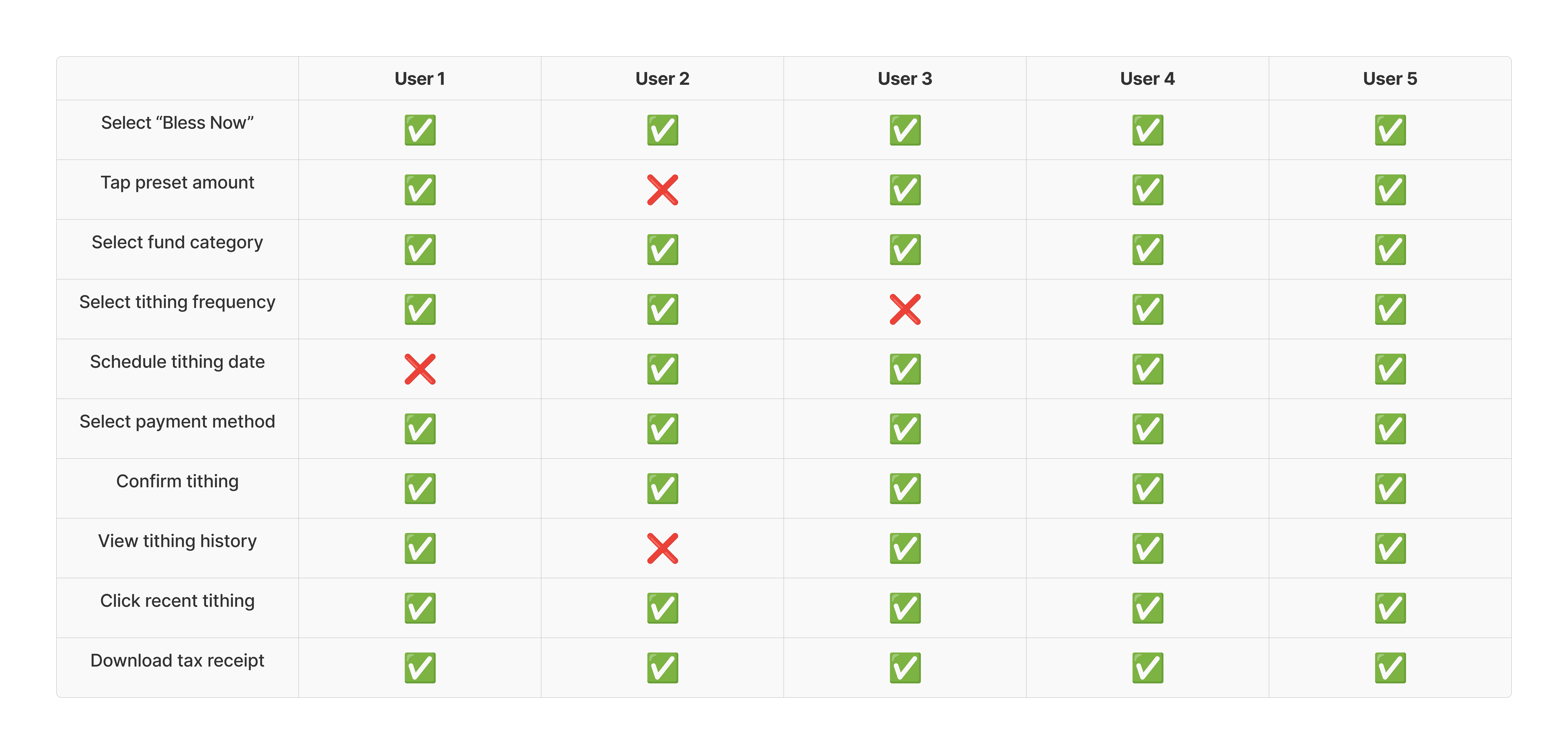
The final round on the high-fidelity prototype reached a 92% average task completion rate.
I made usability changes after the issues were identified.
Reflections
Designing for Faith
A giving app has to do more than process payments. It should turn an obligation into
an act of joy.
Designing for habit and accessibility lowered the barrier for people who want to give consistently.
Transparency Builds Trust
Security badges matter, but people respond more to seeing the direct impact of their gift.
Fund descriptions and live progress indicators addressed the “void” of traditional giving: a clear why matters as much as a secure how.
Friction Can Be a Feature
One-tap speed isn’t always the goal. In a faith context, moving too fast can make a gift feel like a bill payment.
I added a Review & Confirm step to give users a moment of reflection. I judged that the quality of the experience mattered more than saving two seconds.